NDSU Athletics had quite an impressive winter sports season, full of milestones, upsets, awards and surprises. The Bison knew how to put on a show, and a "first-ever" seemed to happen every other week. It was certainly an exciting time to be a fan or faculty member of North Dakota State. Luckily with my role, I can do both.
Wrestling | Regular Season
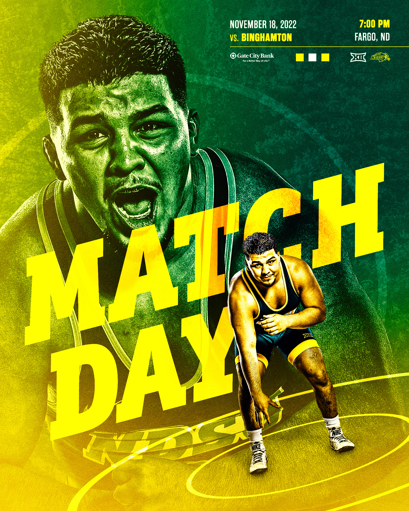
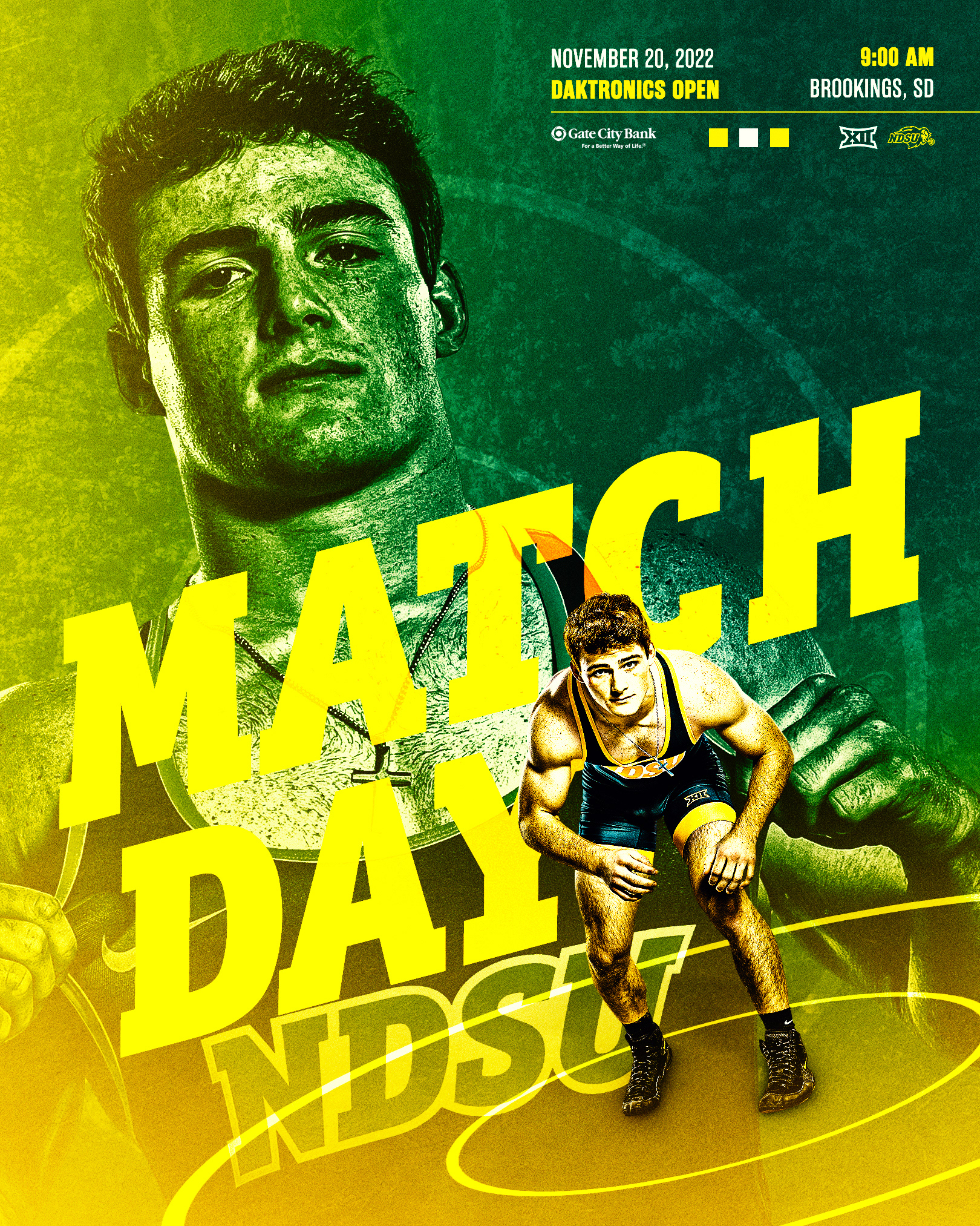
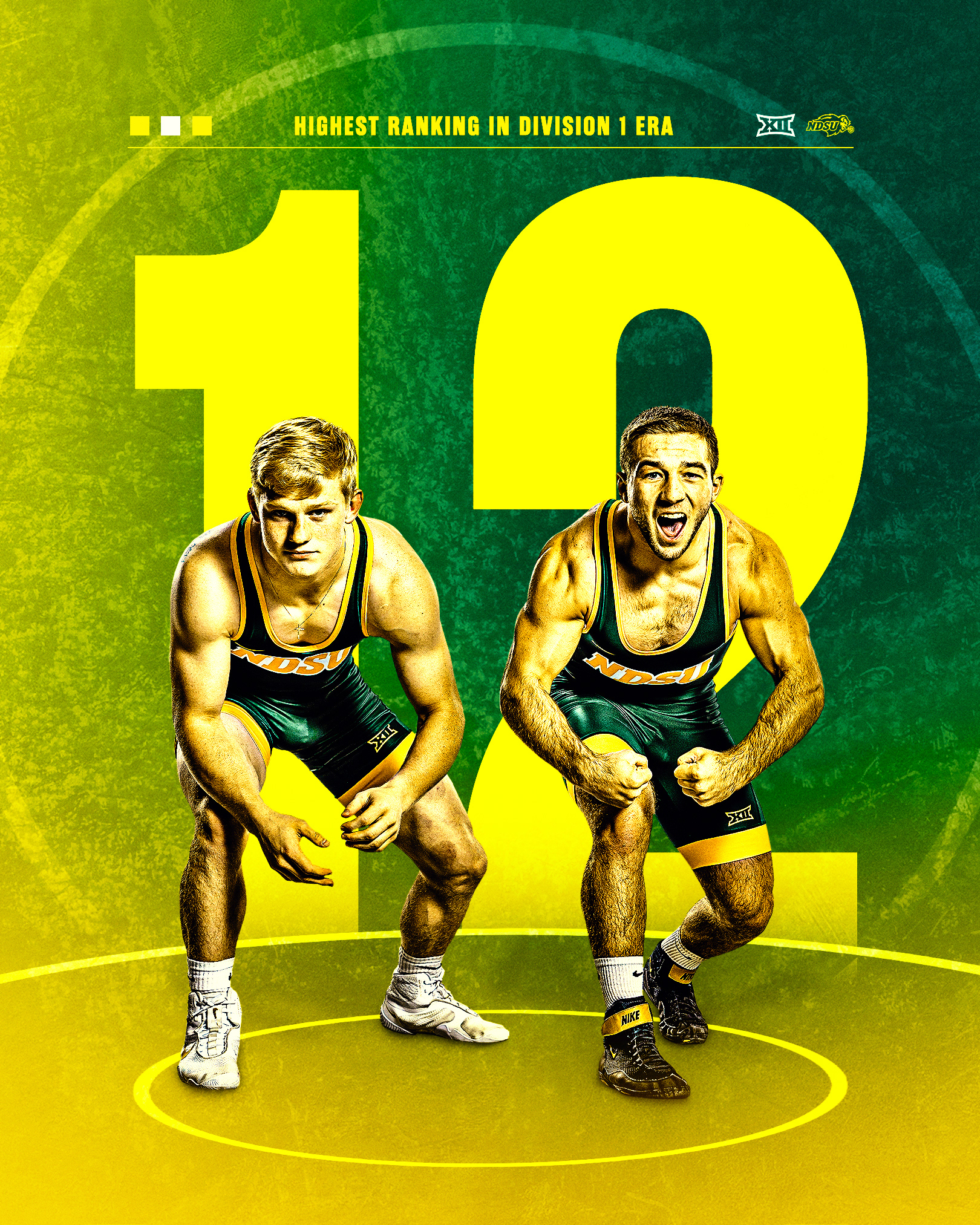
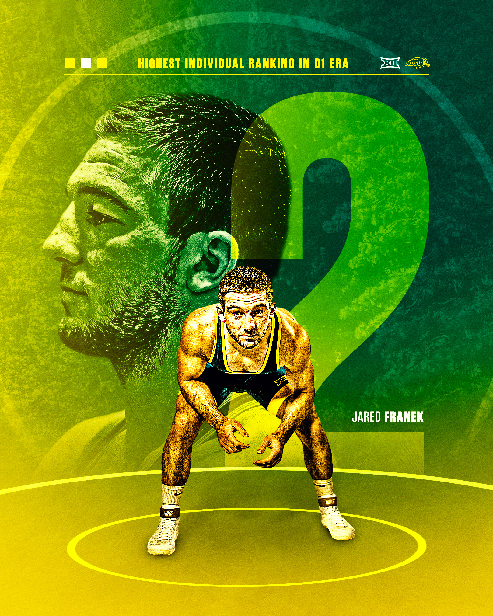
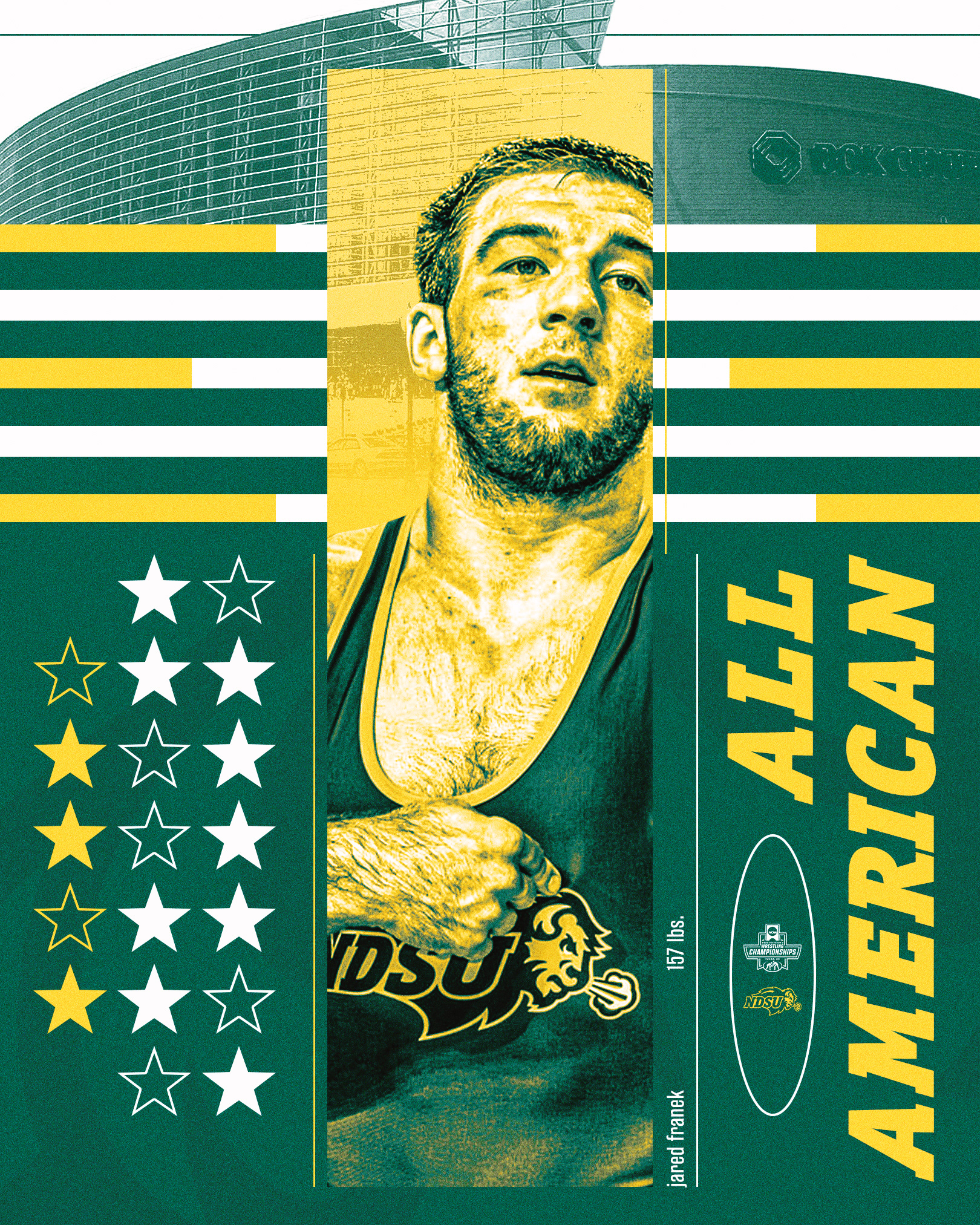
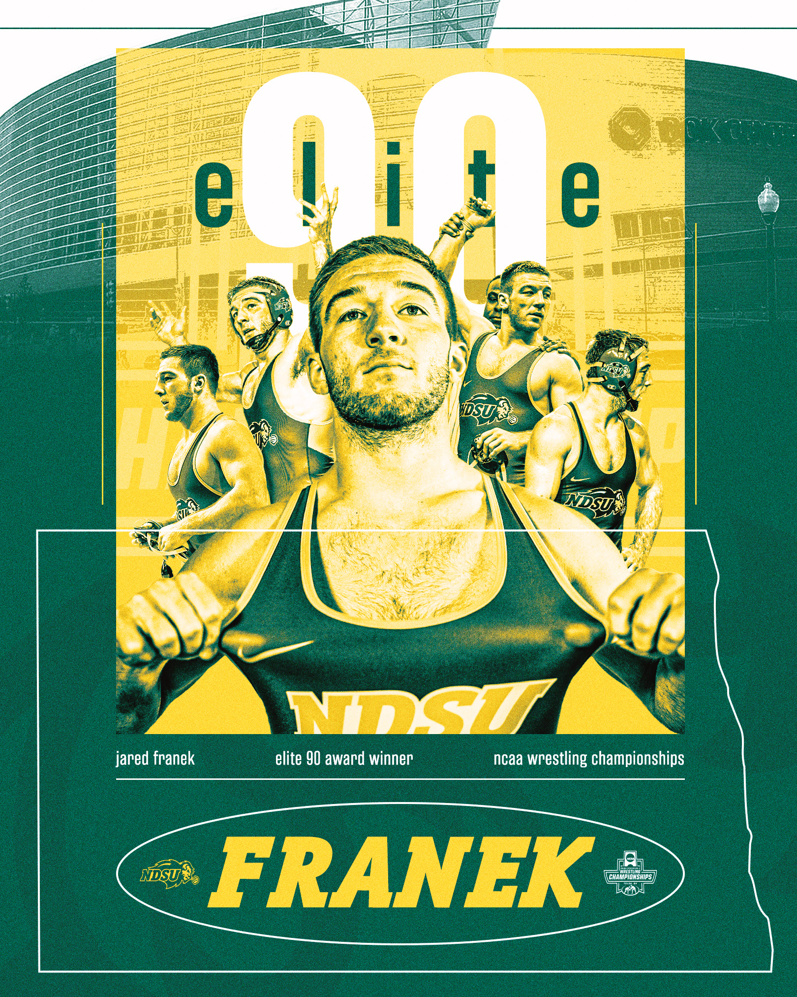
Enhanced detail, bright yellow shading and various blending modes helped establish the visual branding during NDSU Wrestling's regular season. This paired well with a season full of program milestones.

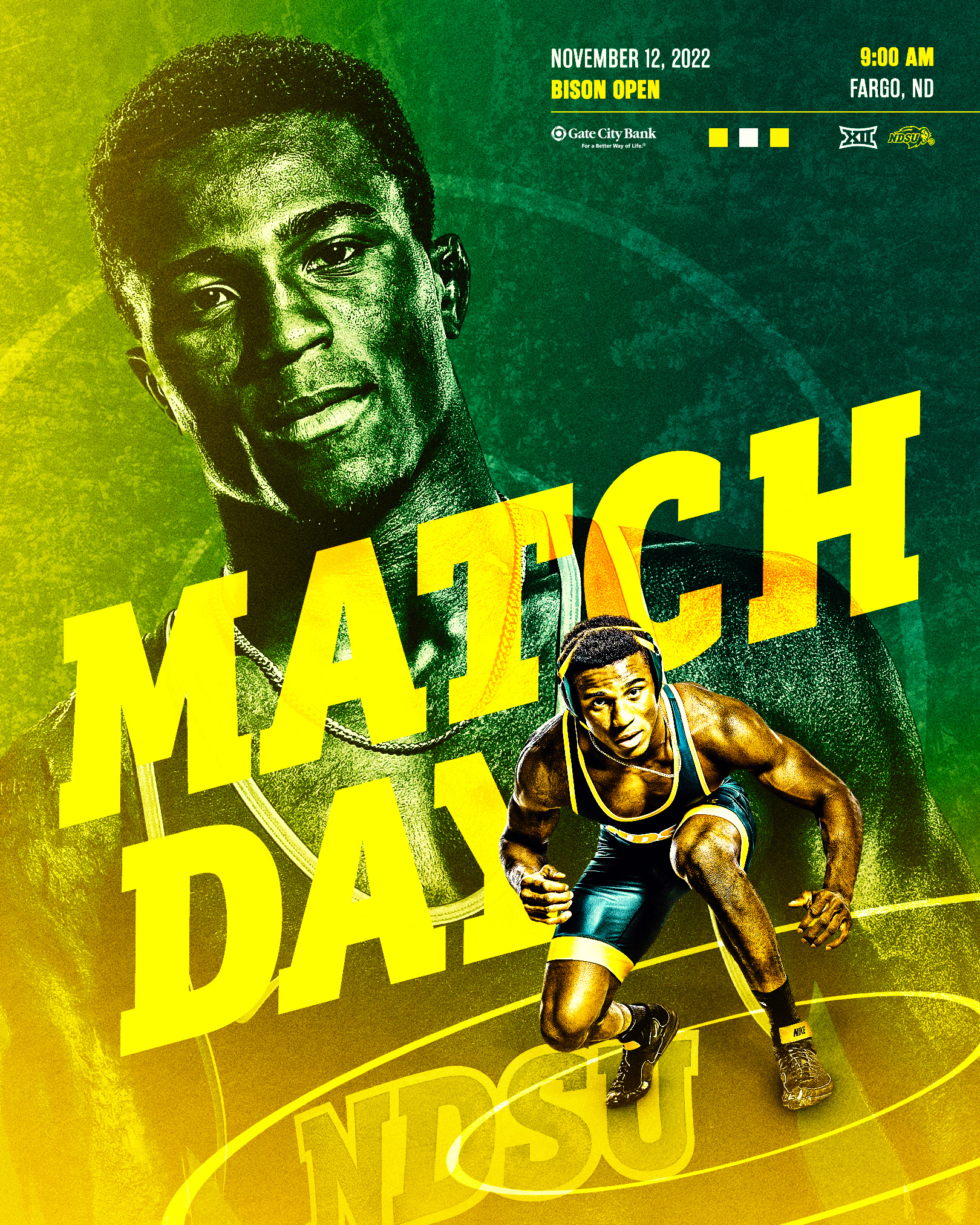
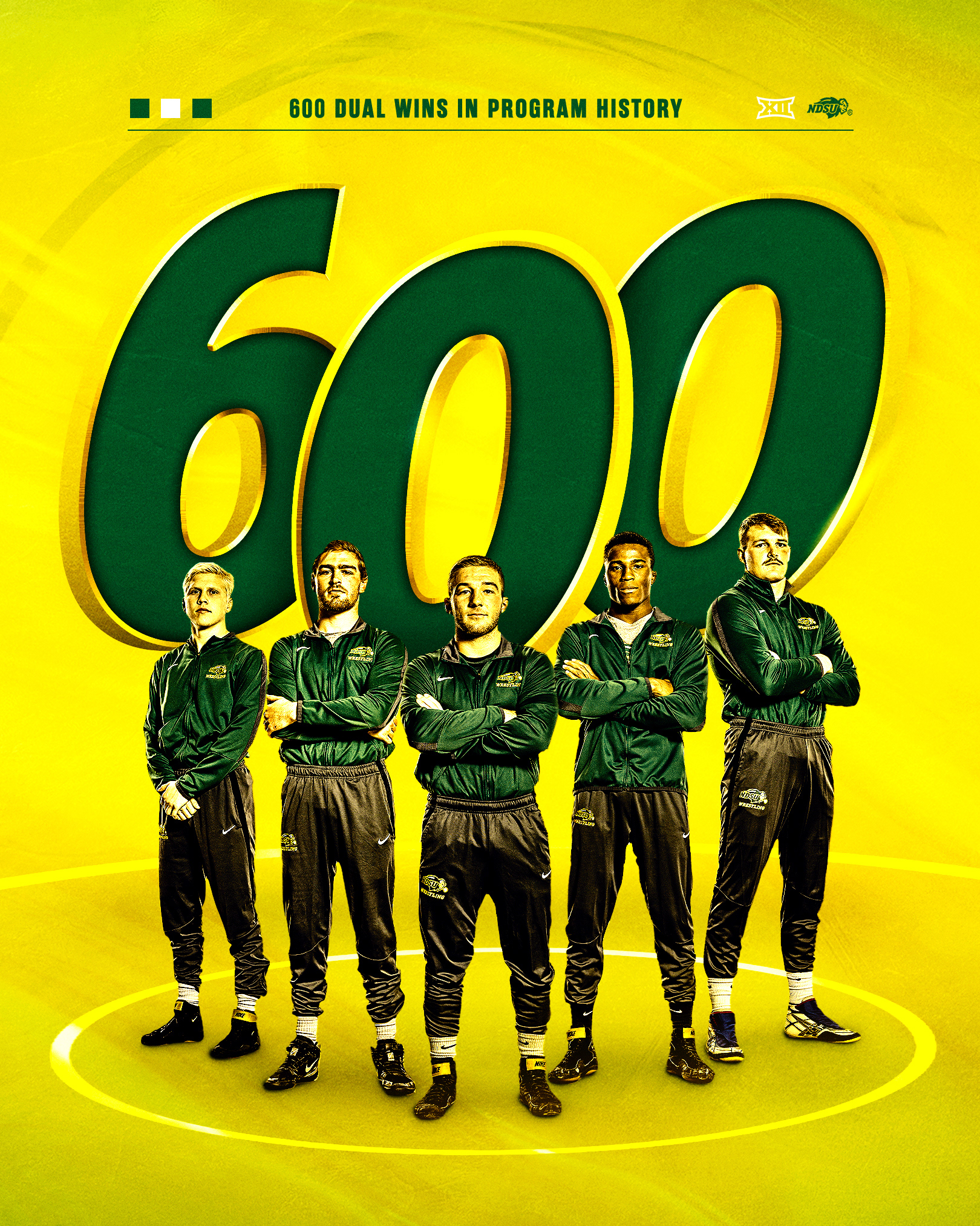
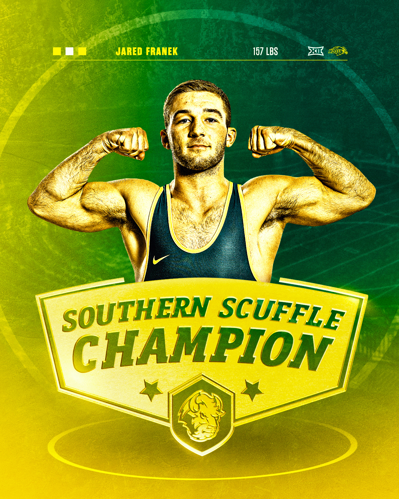
Wrestling | Postseason
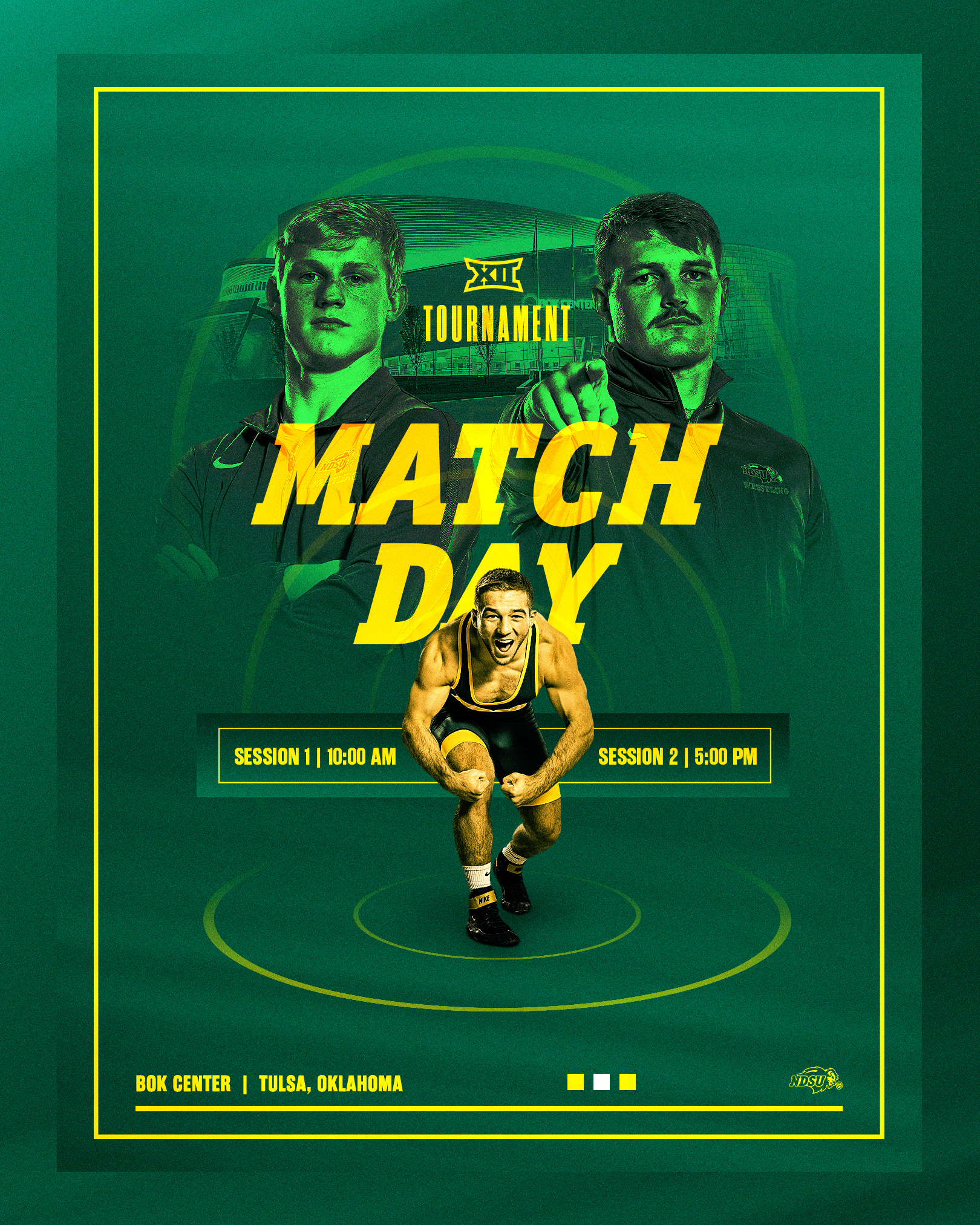
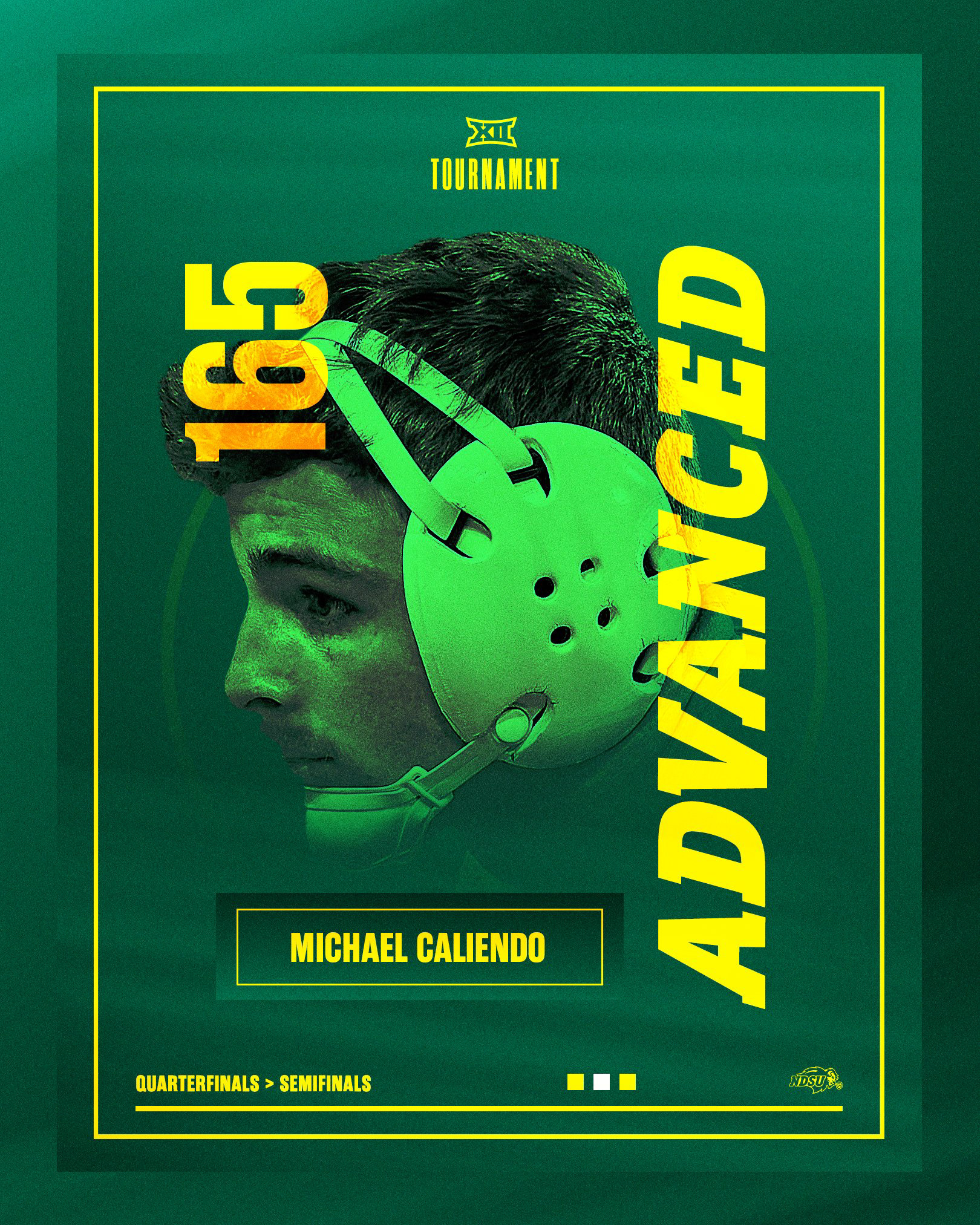
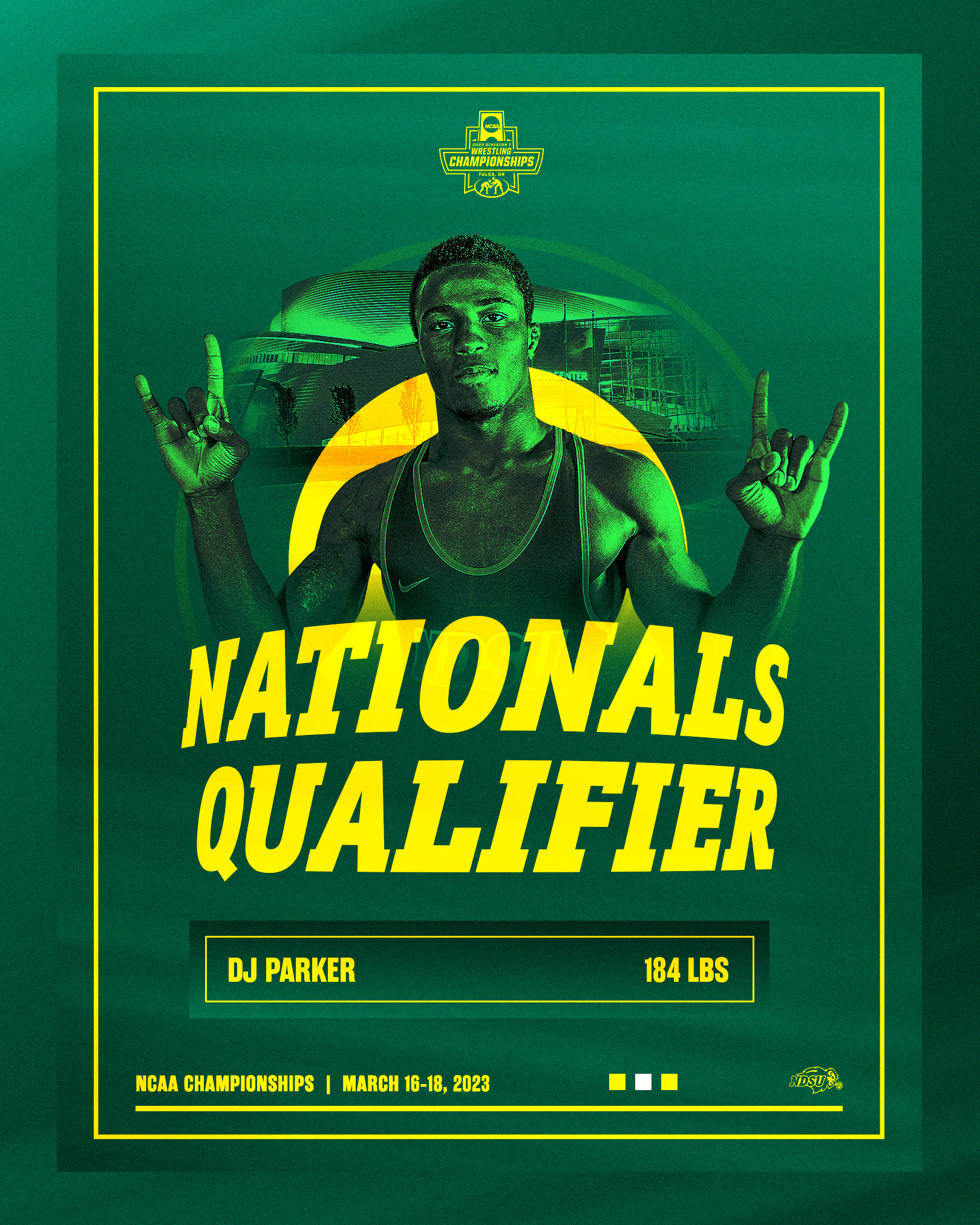
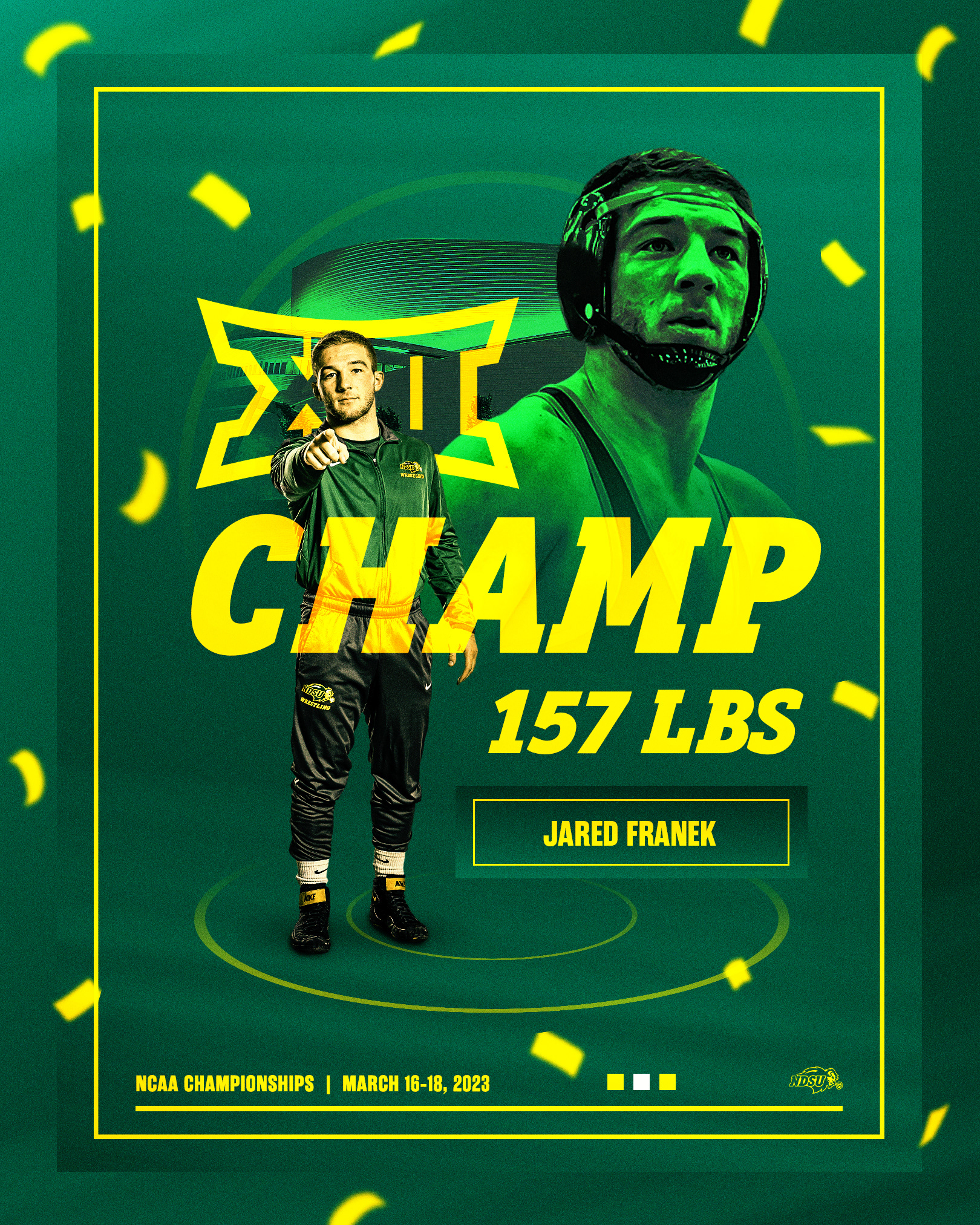
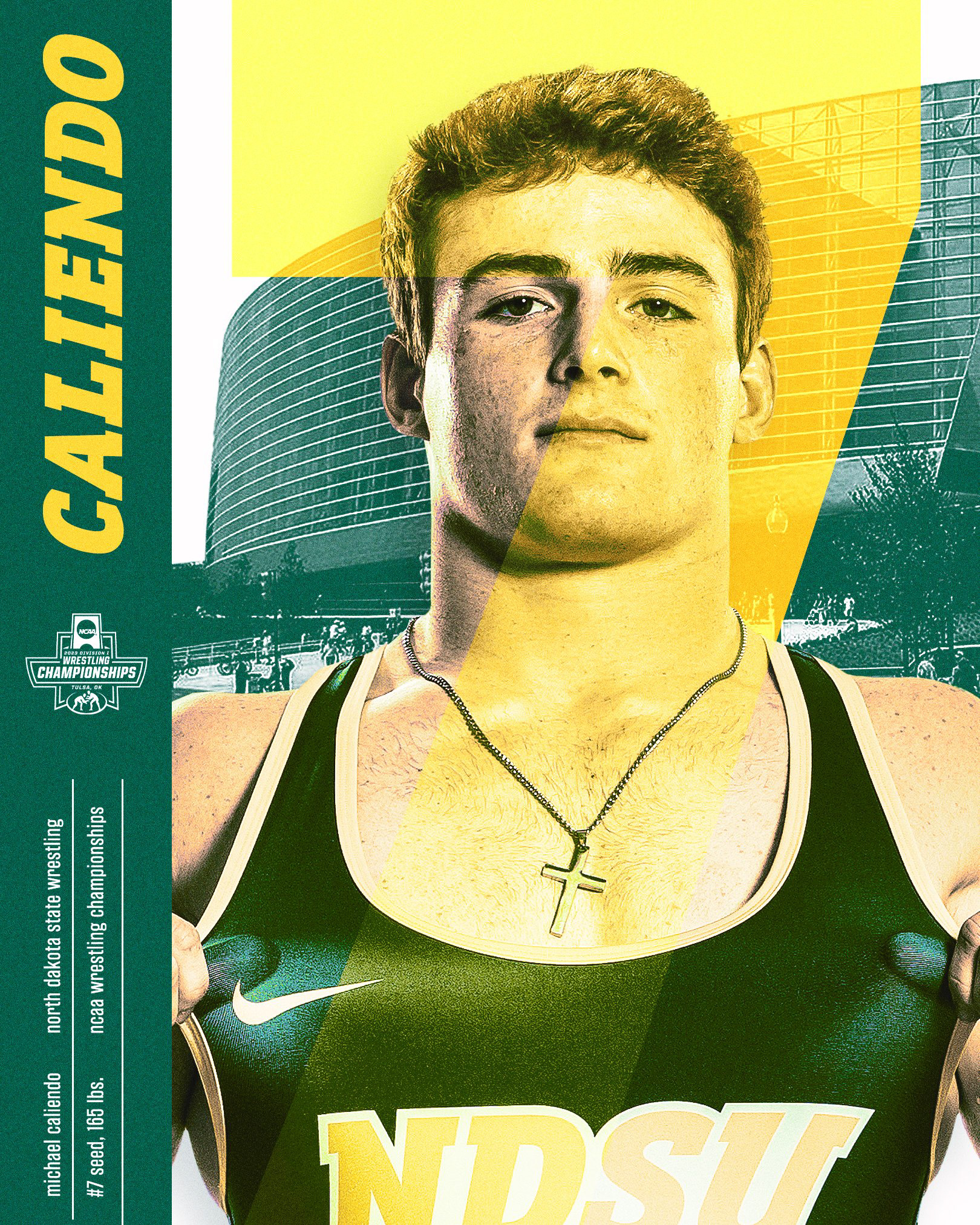
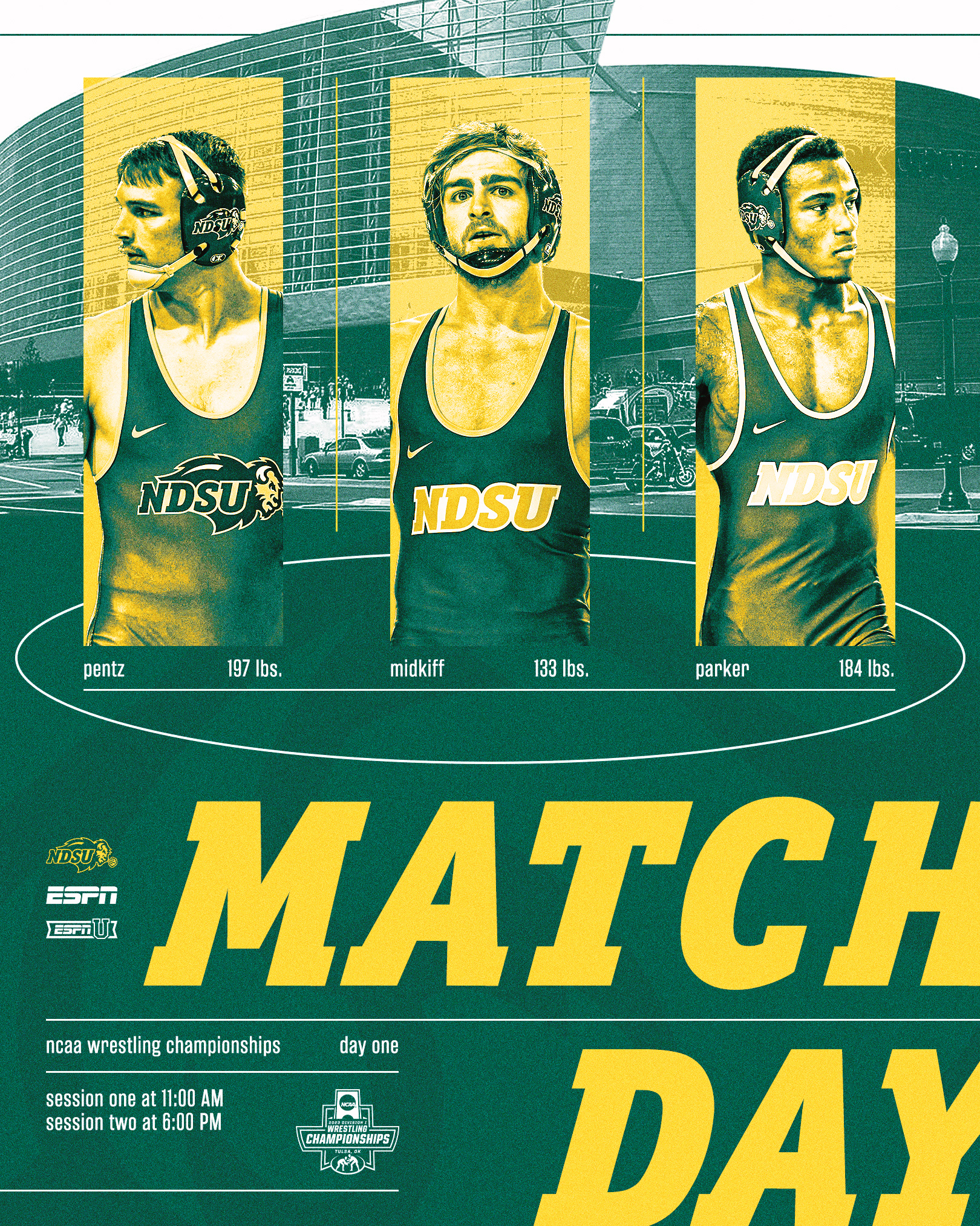
The Big 12 Tournament and NCAA Wrestling Championships provided an opportunity to push the brand limits for our fans' social media timelines. This led to unique styles and new techniques for each of our trips to the Bok Center.
Men's Basketball | Regular Season
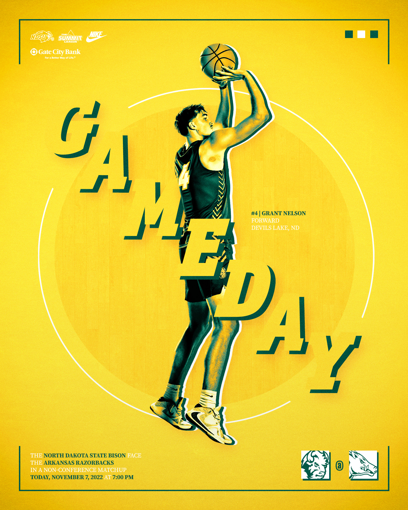
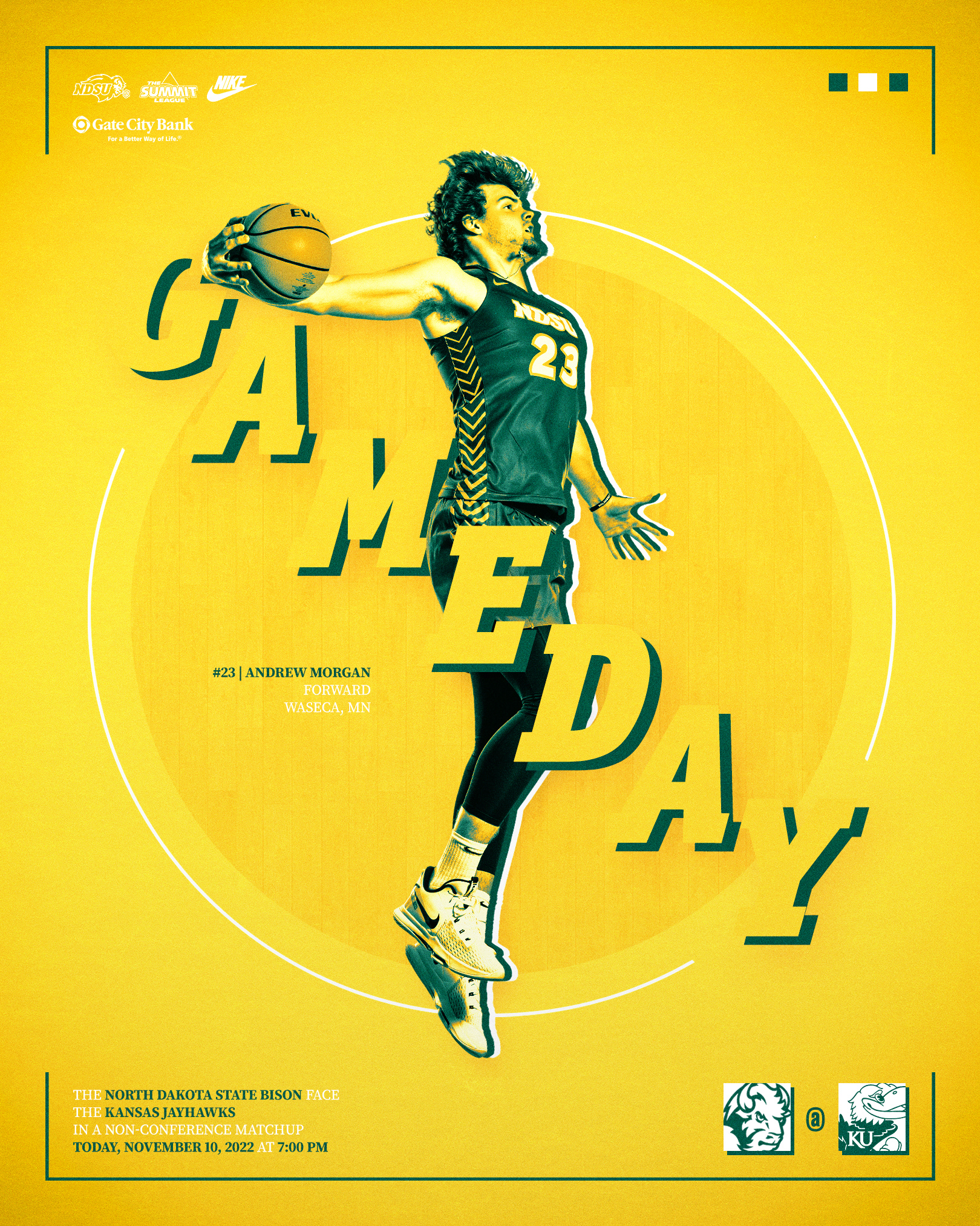
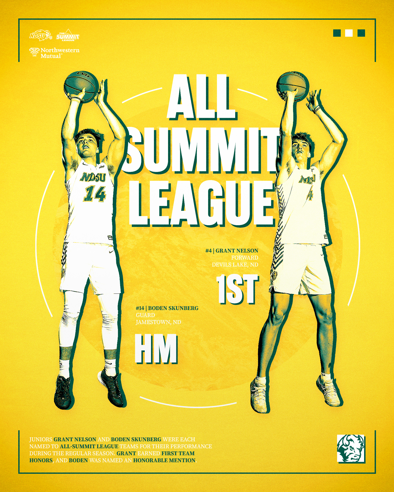
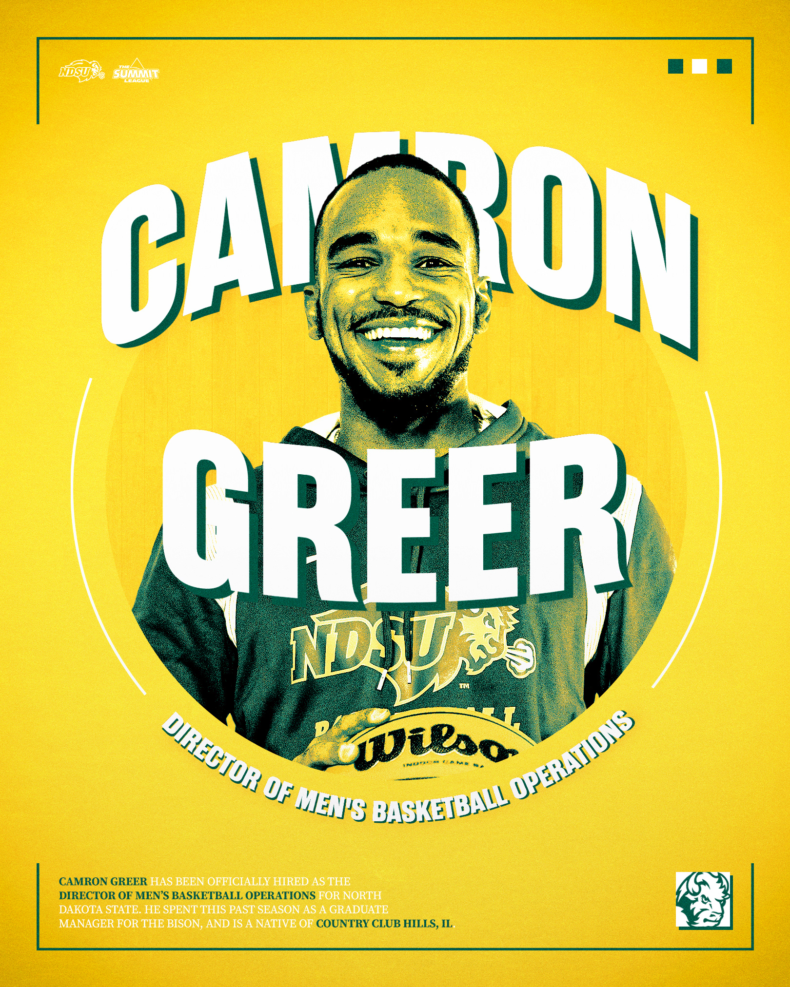
The "Baby Bison" turned a lot of heads this season, and I hoped to do the same with their graphics. Consistency with our women's basketball program was also important, noticeable with specific design elements found across both sports' campaigns and collections.
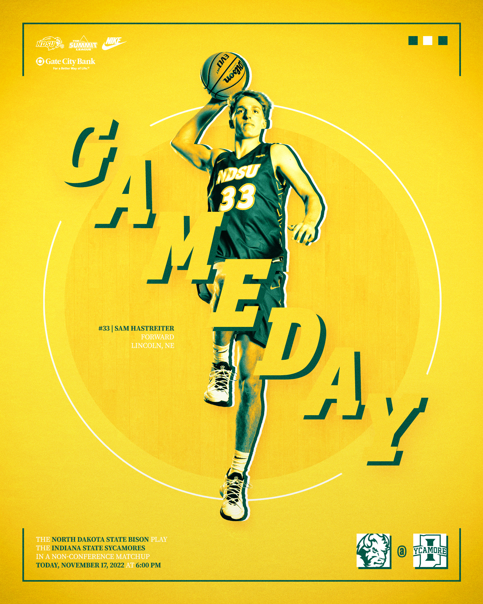
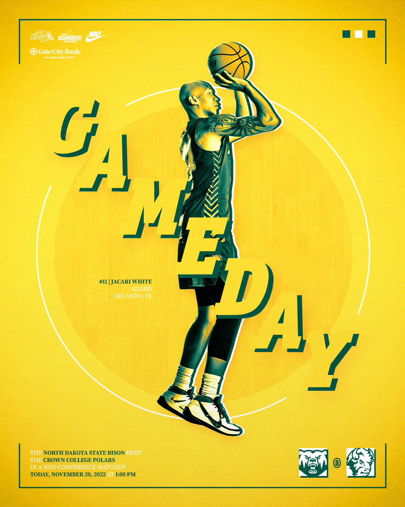
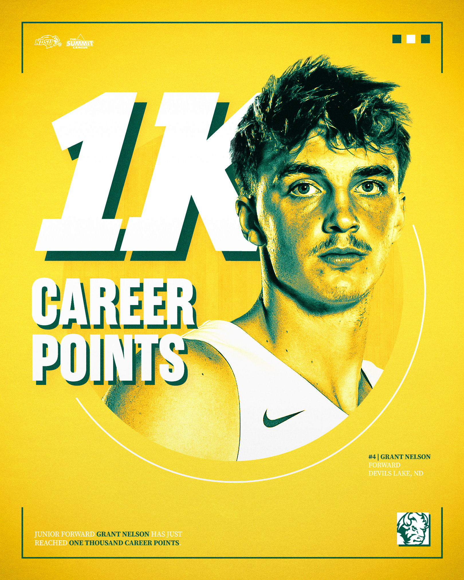
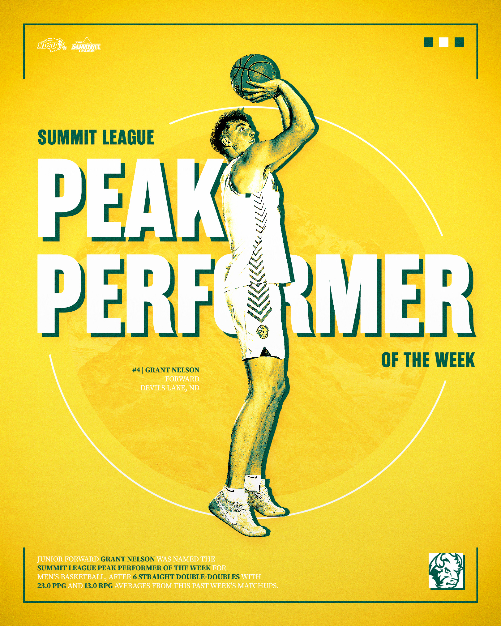
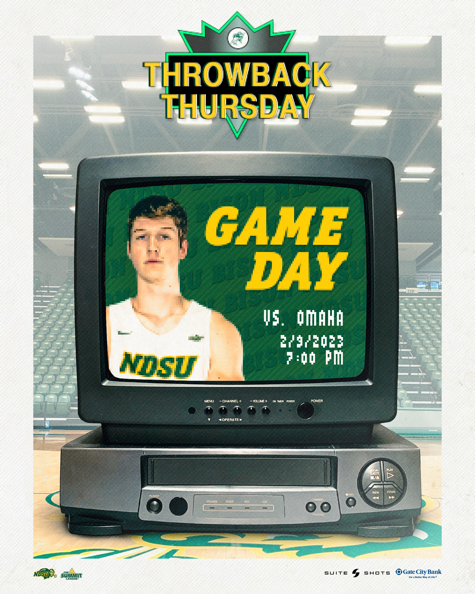
Men's Basketball | Throwback Thursday
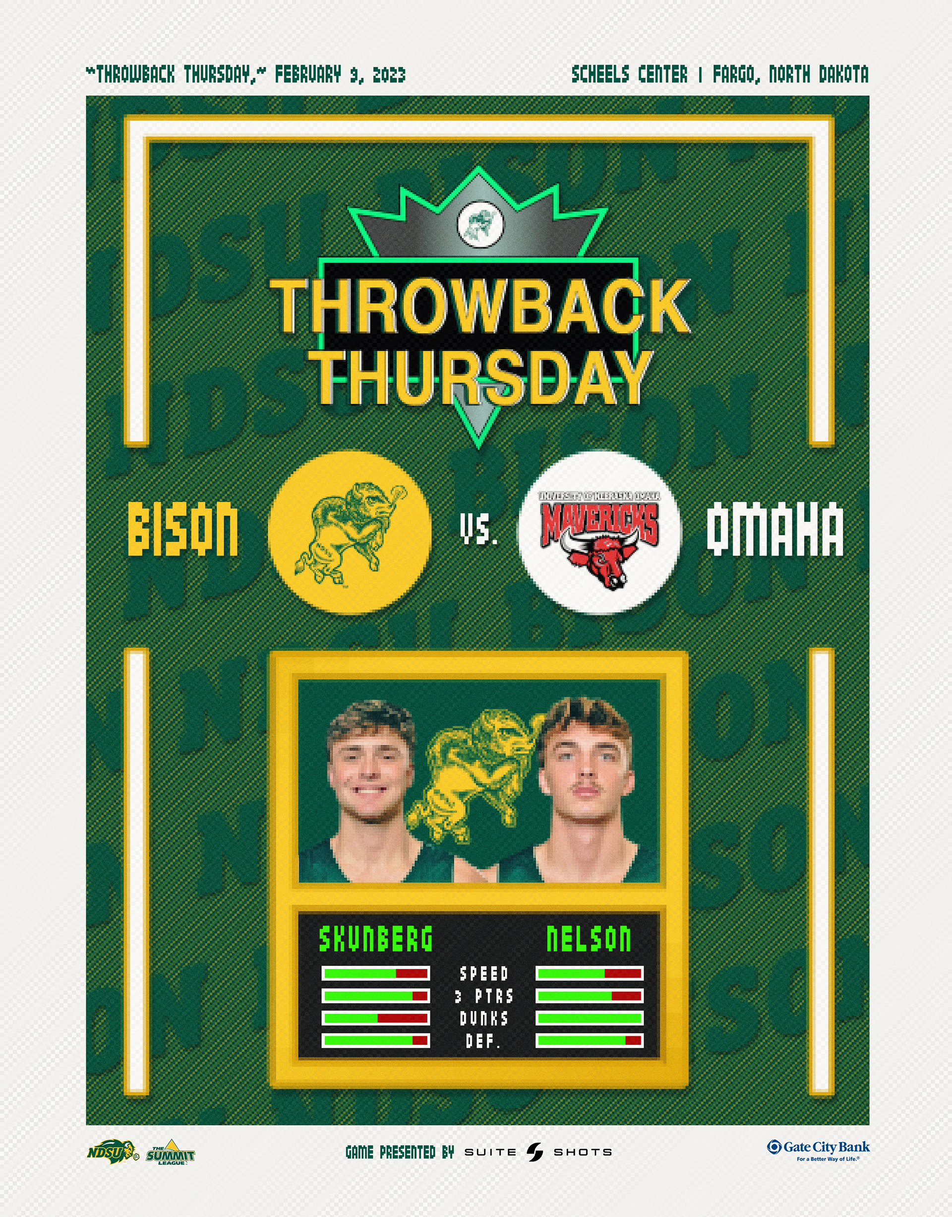
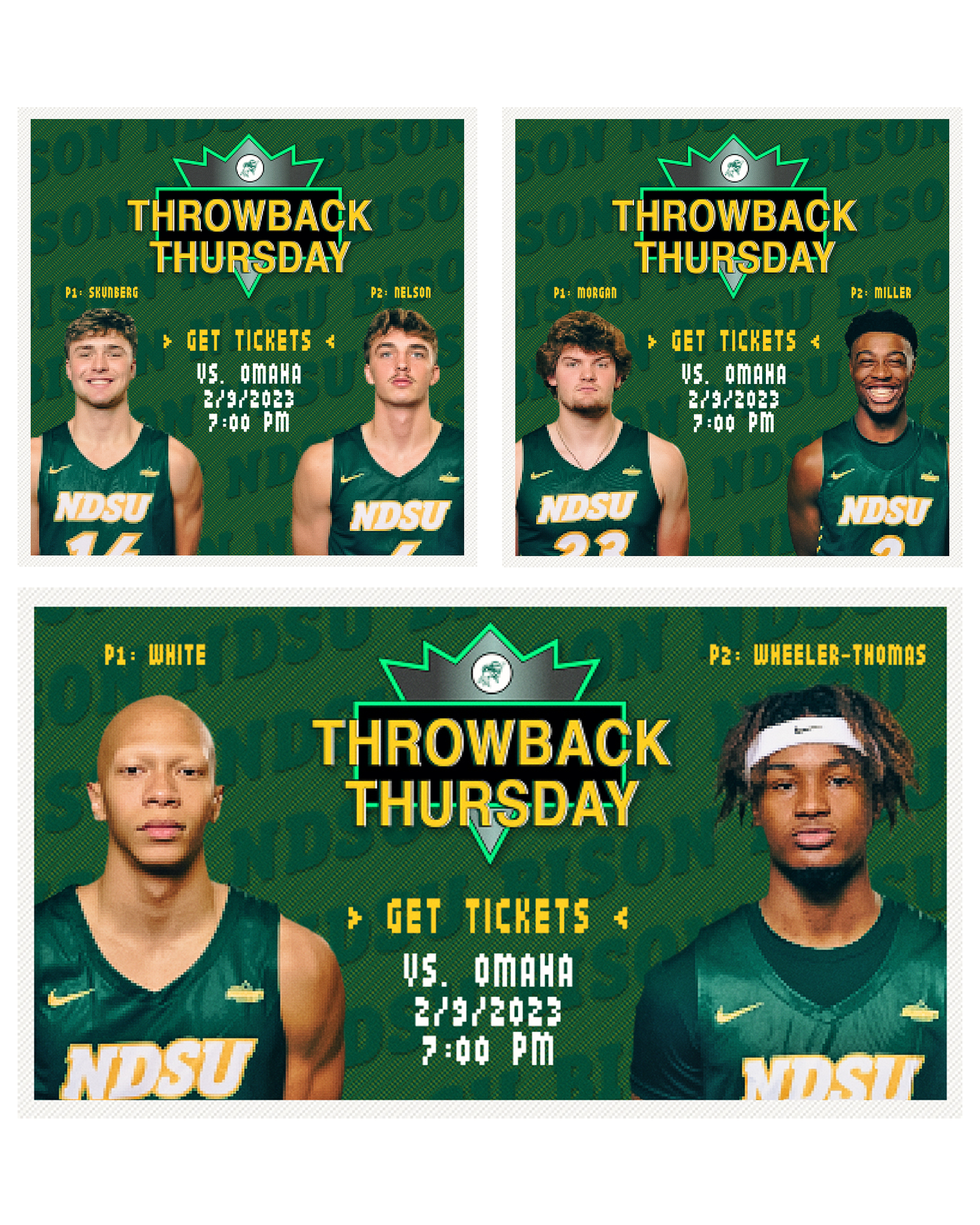
The vintage-themed matchup against the Omaha Mavericks allowed our offices to put together a unique stream of content for the game. NBA Jam was the inspiration behind an old-school collection of graphics, game programs, videos and social media posts.
Men's Basketball | Postseason
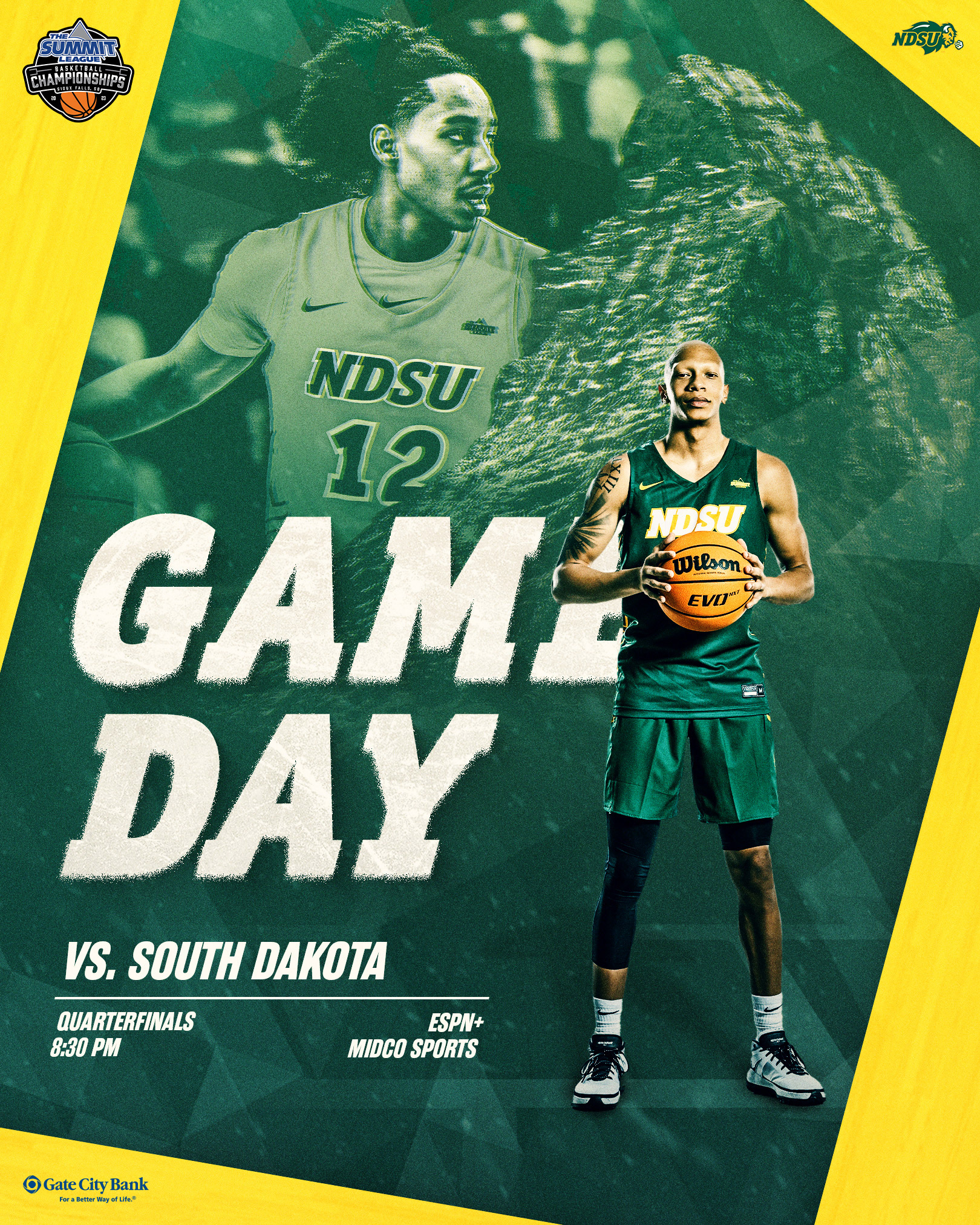
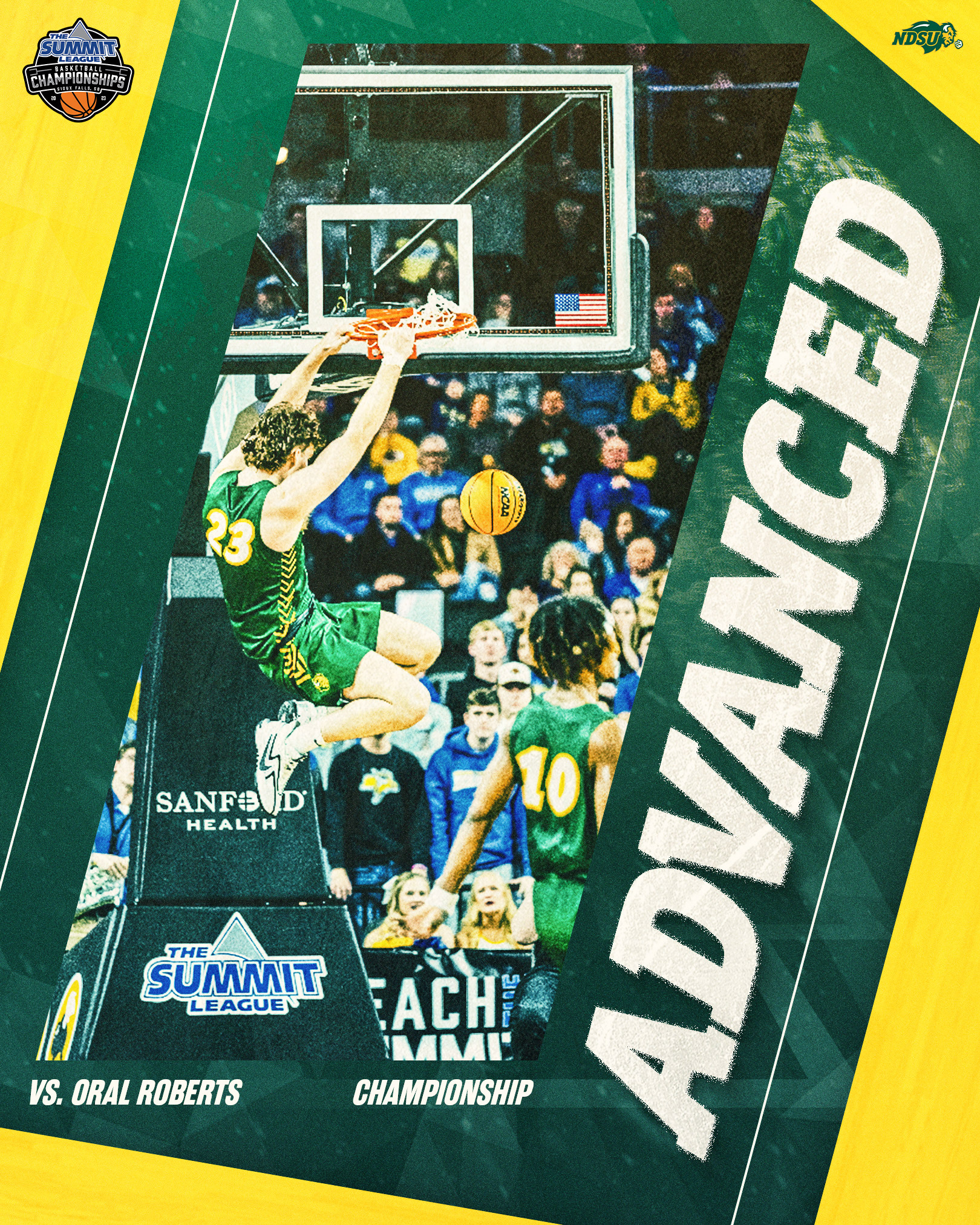
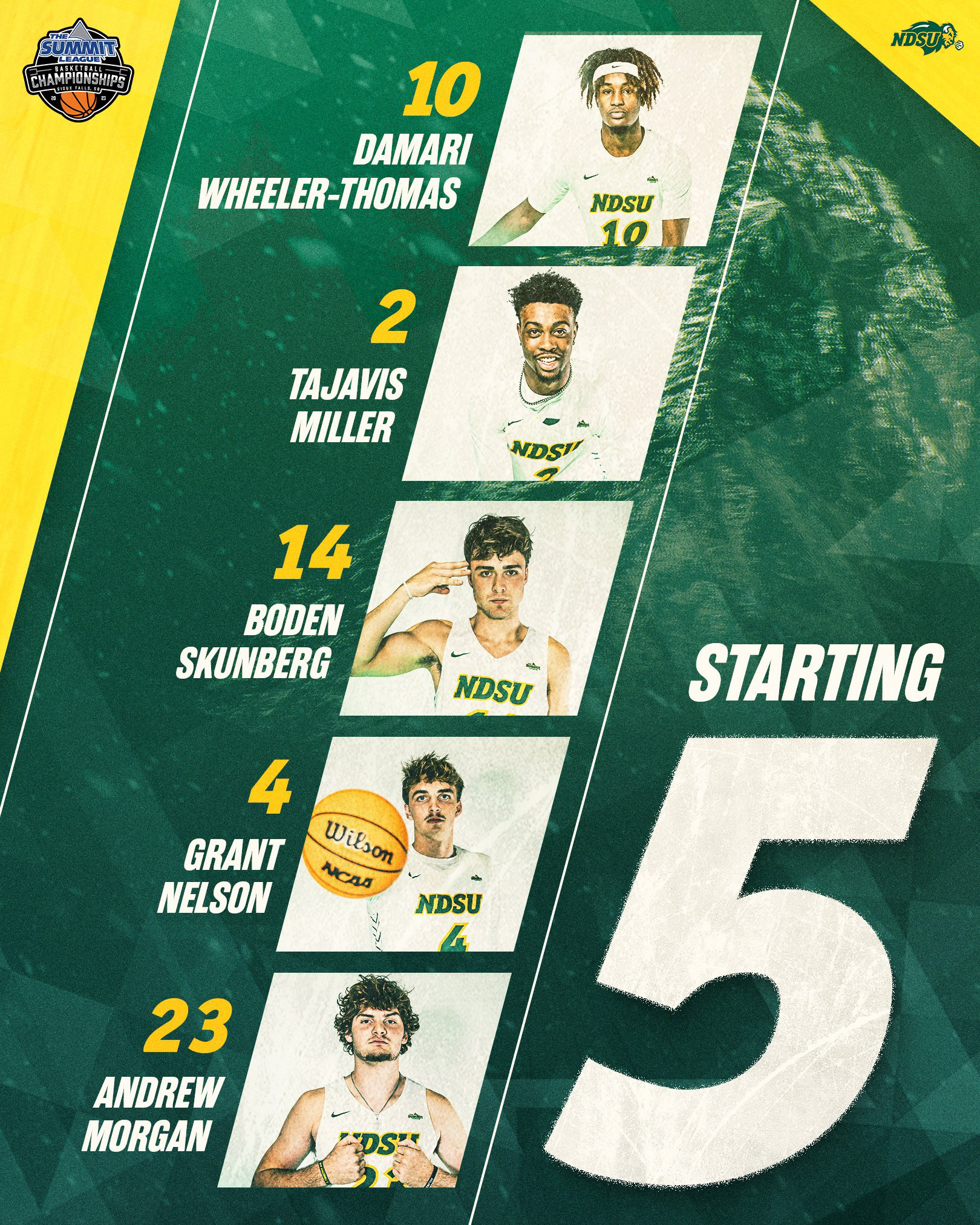
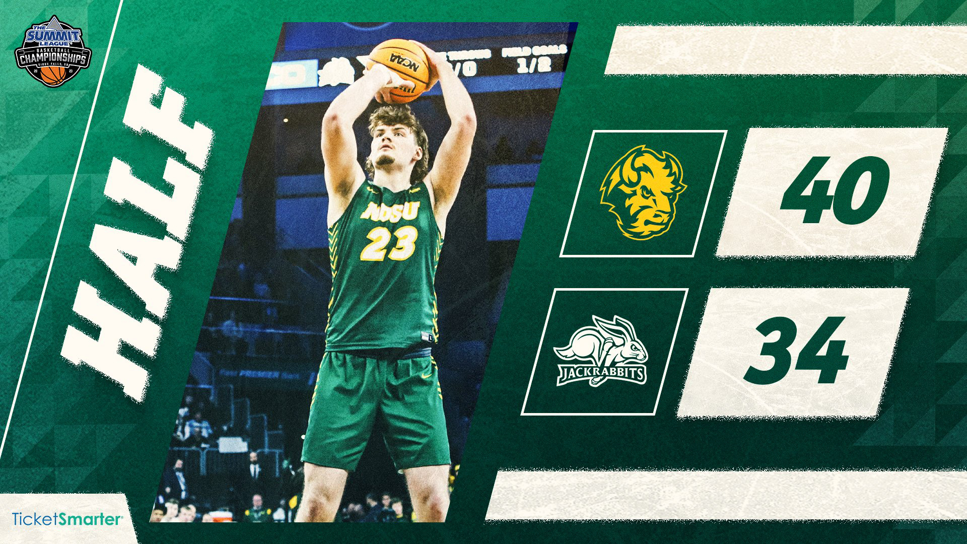
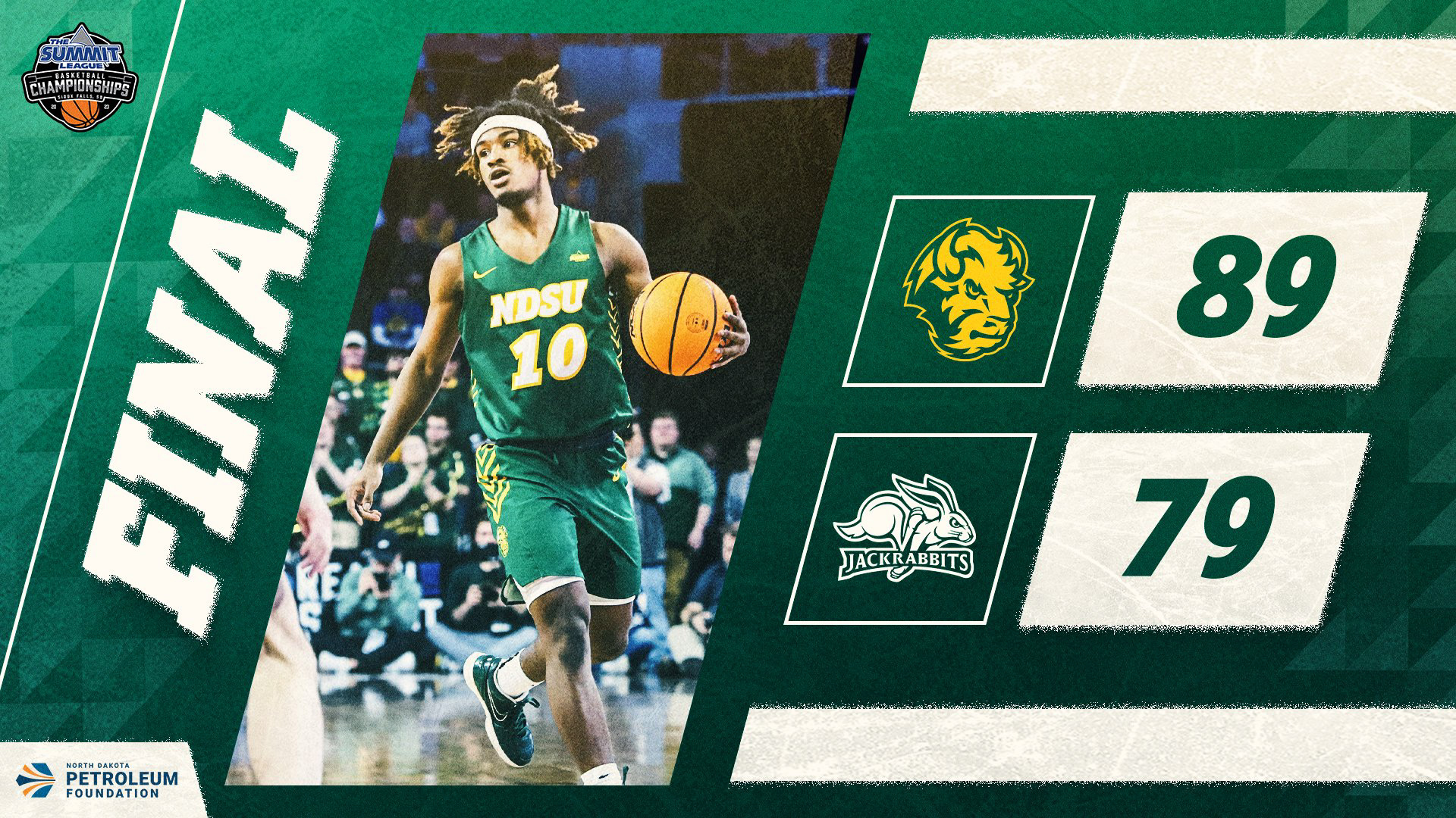
This look was inspired by the cold, long winters of the Dakotas, something I wanted to capture with these pieces. To accomplish this, I shifted toward a cooler color palette and snowy, frozen elements for our Summit League Tournament run.
Women's Basketball | Regular Season
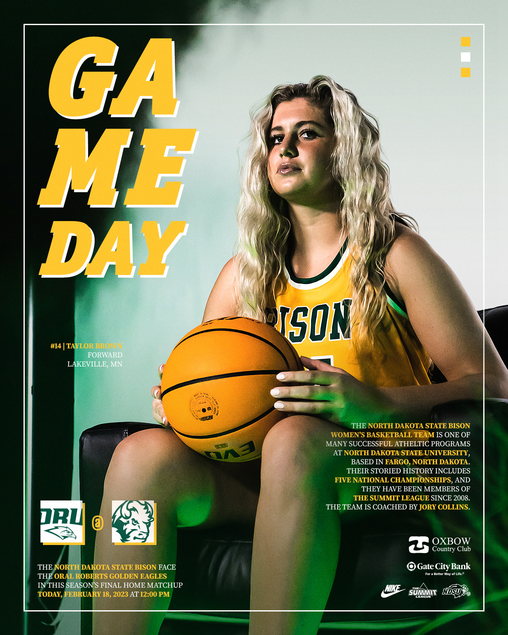
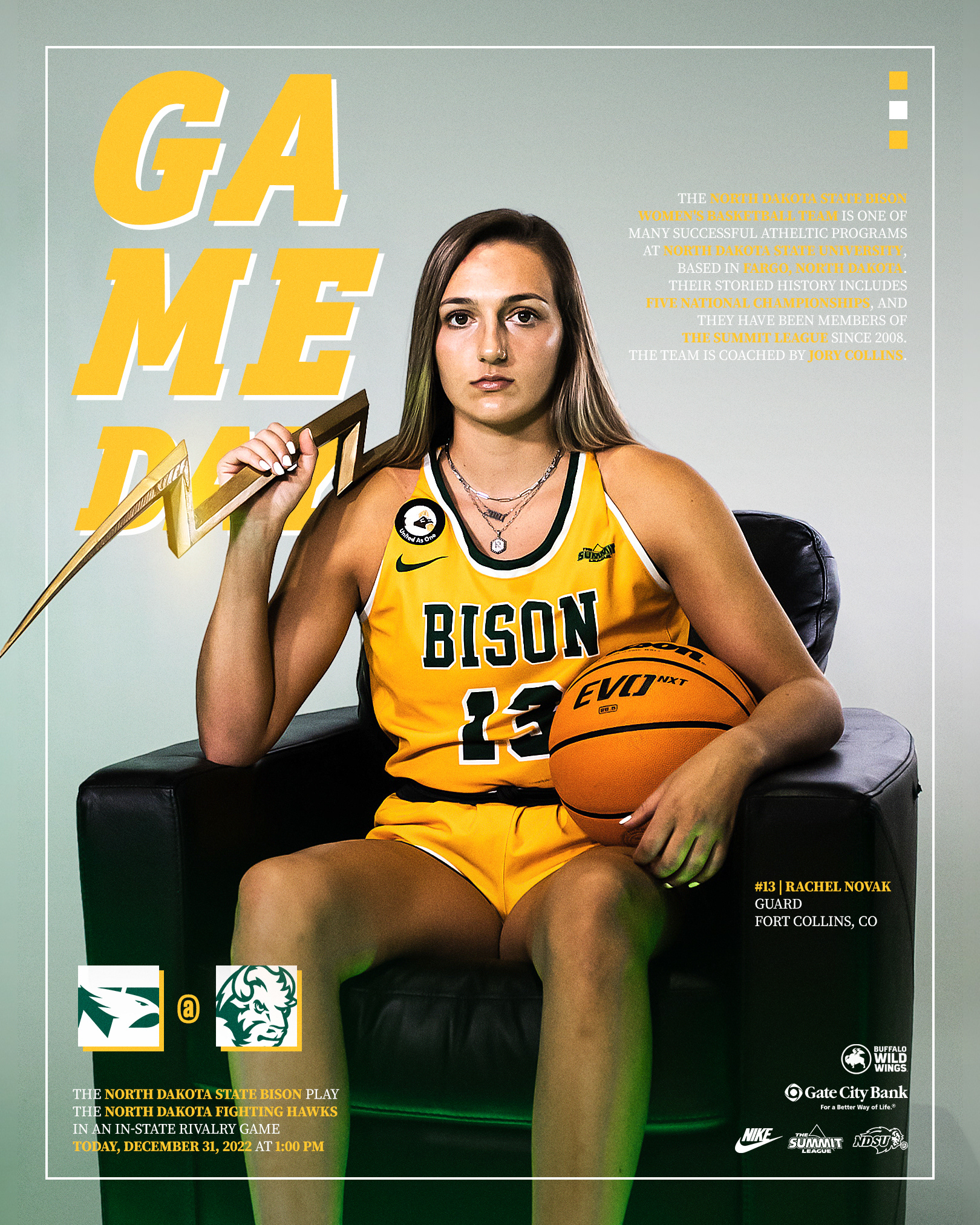
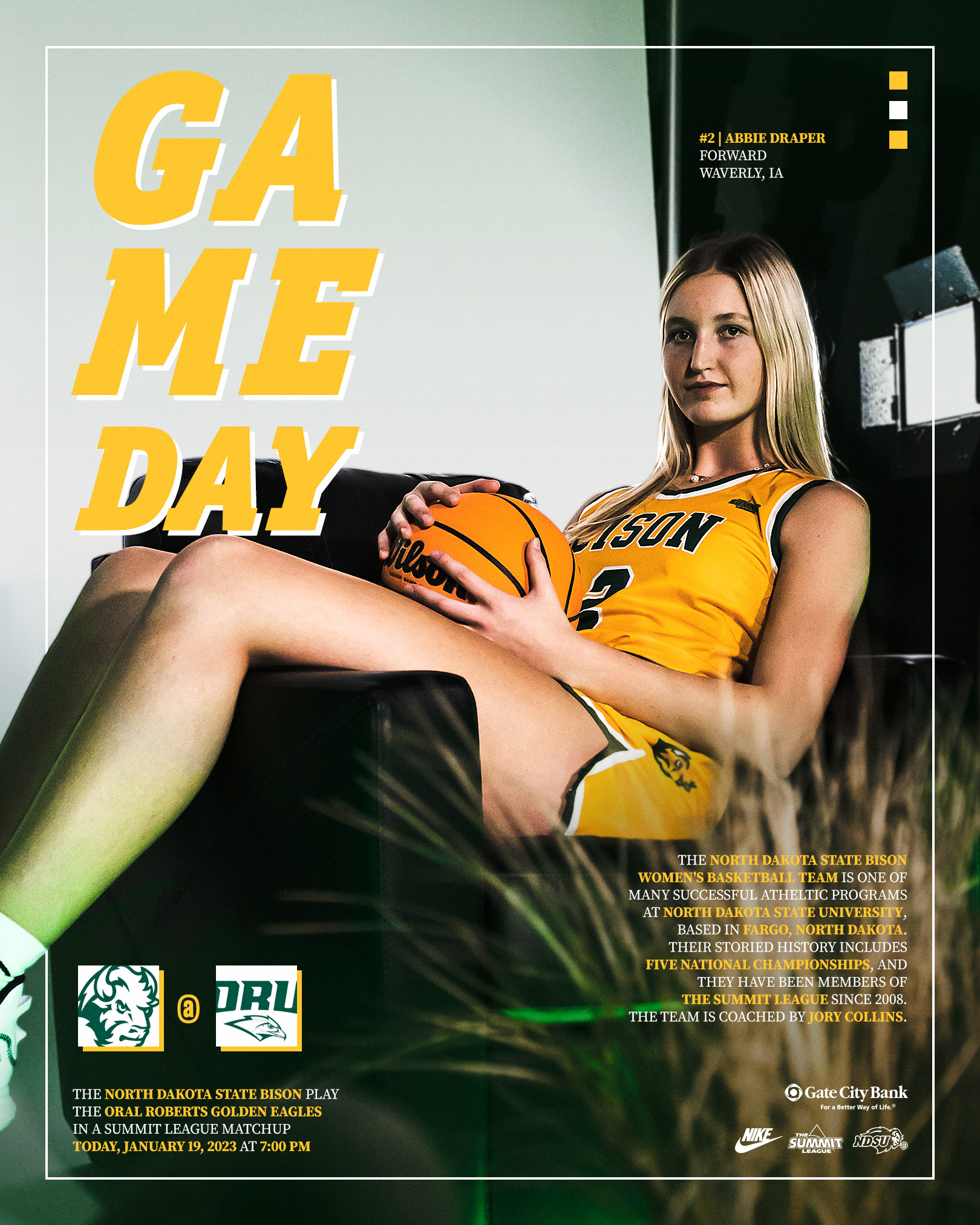
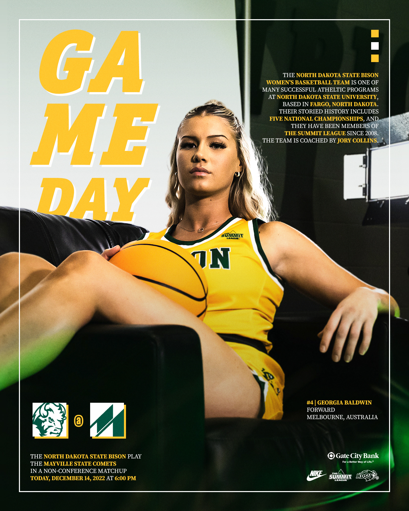
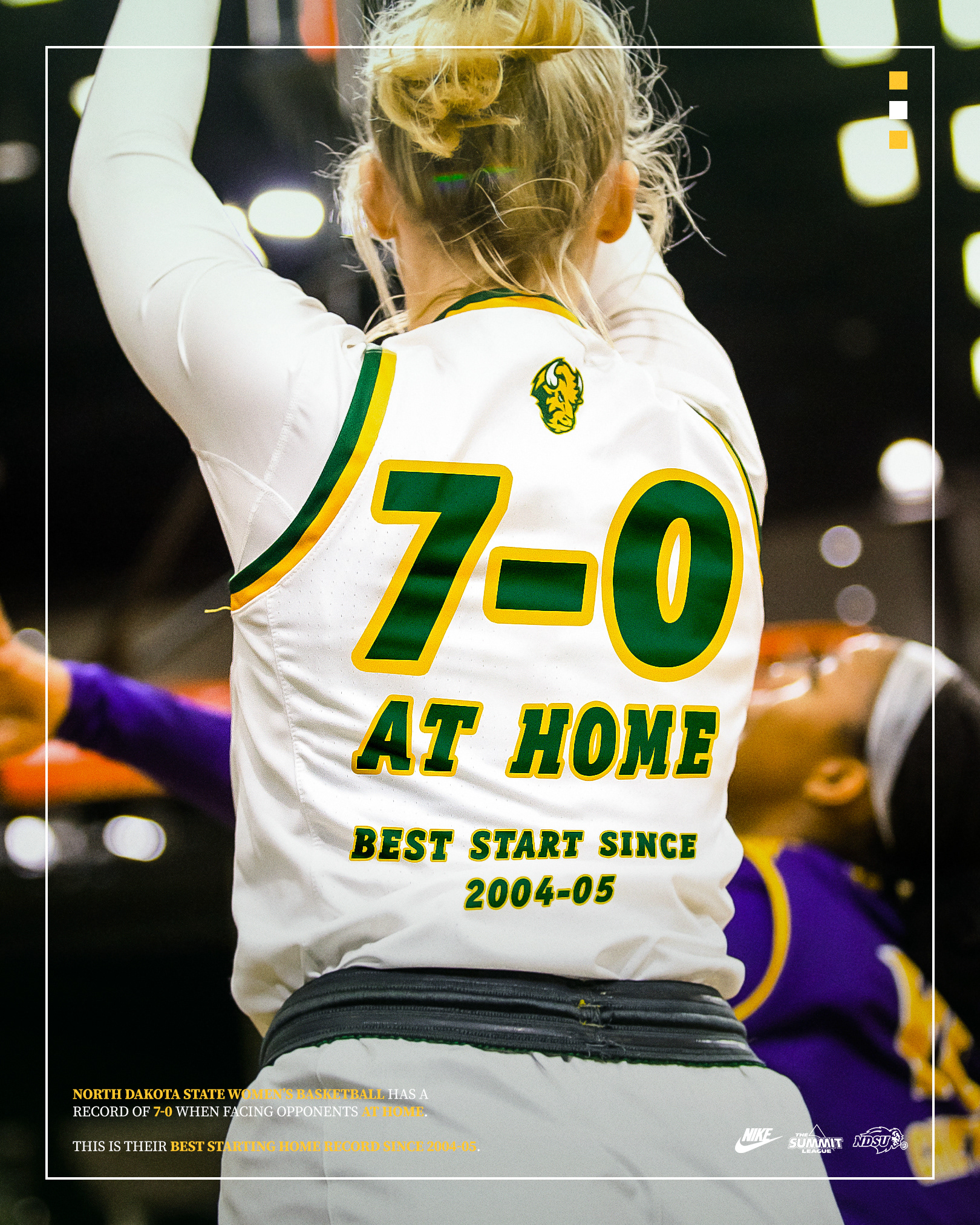
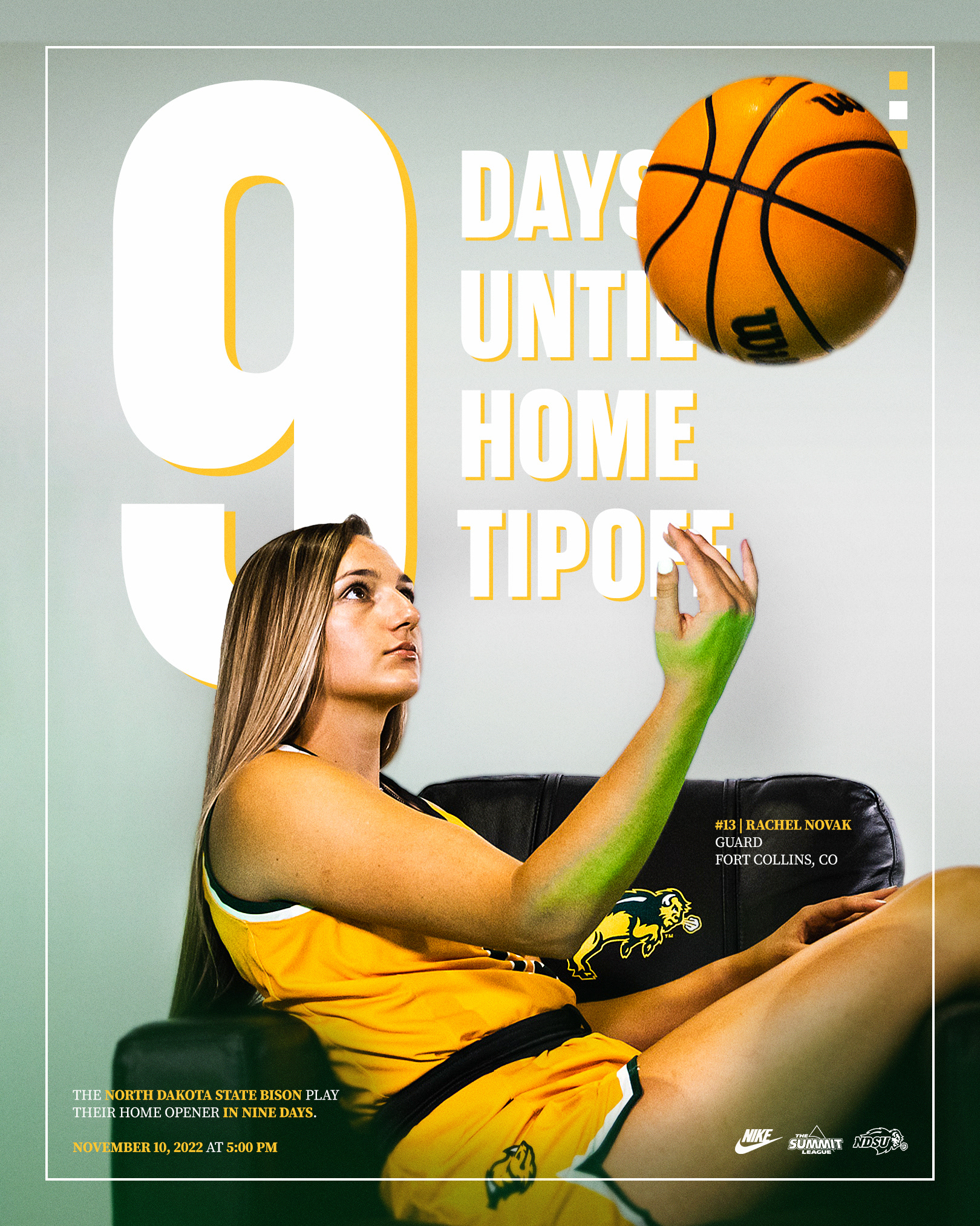
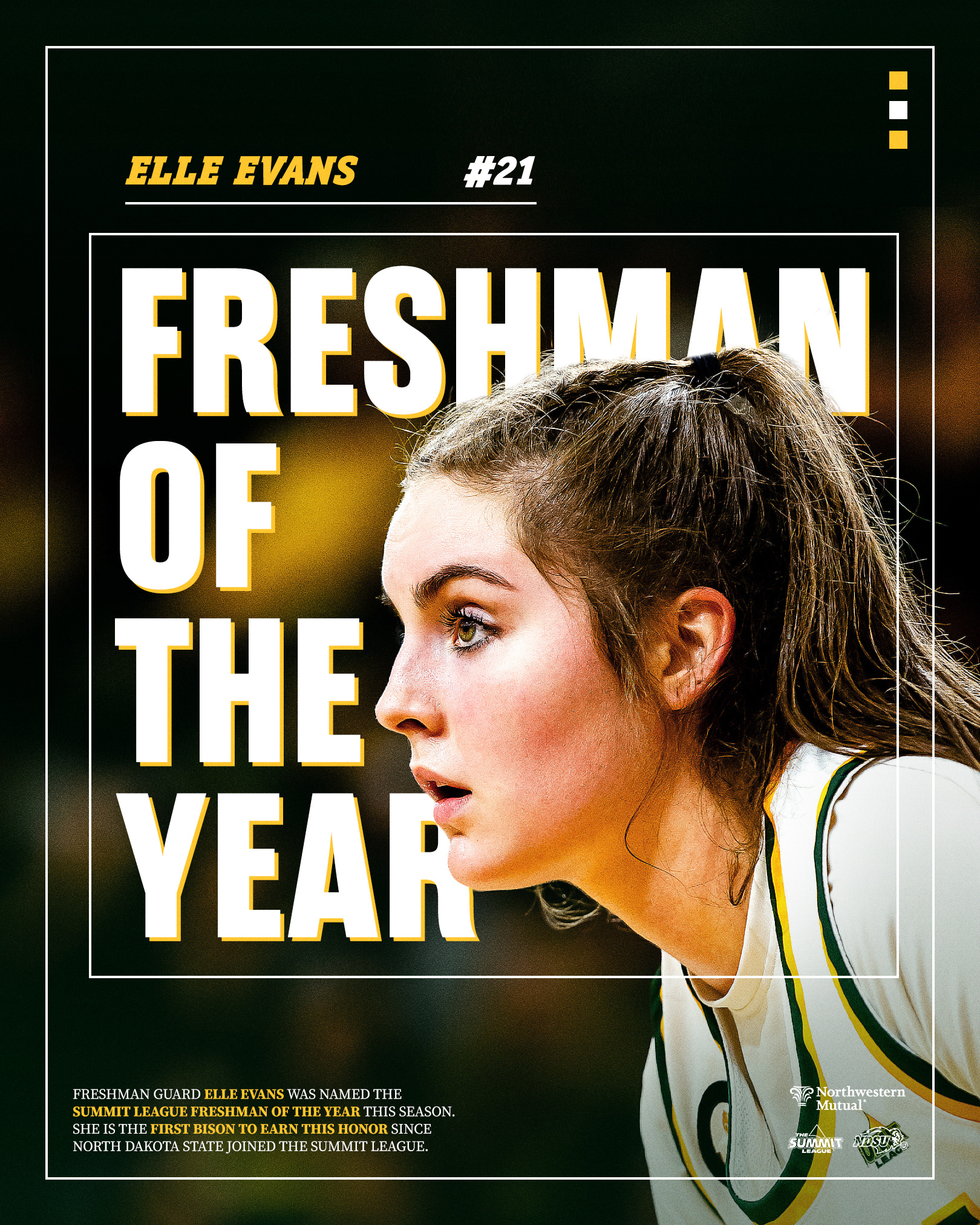
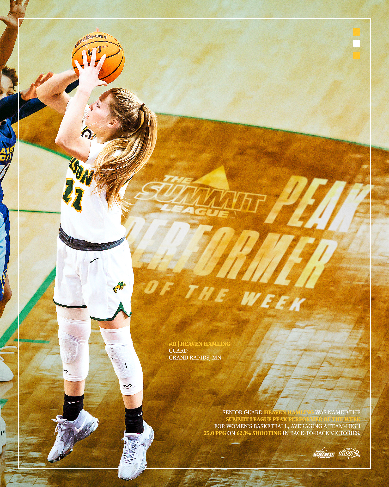
Instead of building graphics out of photo assets, I decided to do the opposite for women's basketball. Strong photography and editing served as the primary focus, with minimal design assets and text built around the subject.
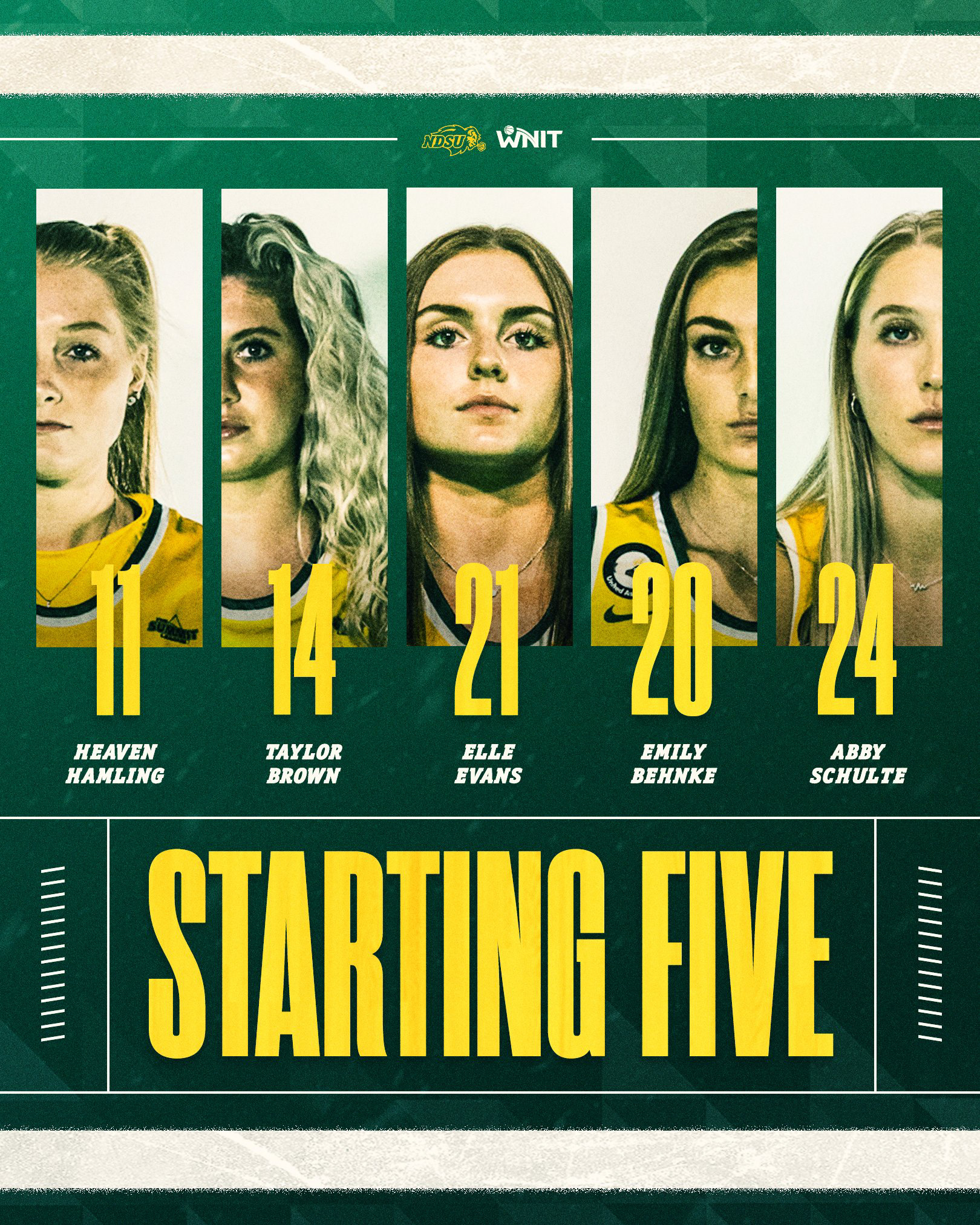
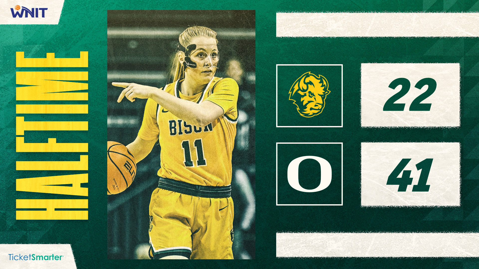
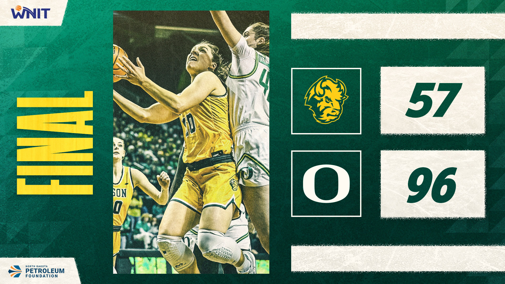
Women's Basketball | Postseason
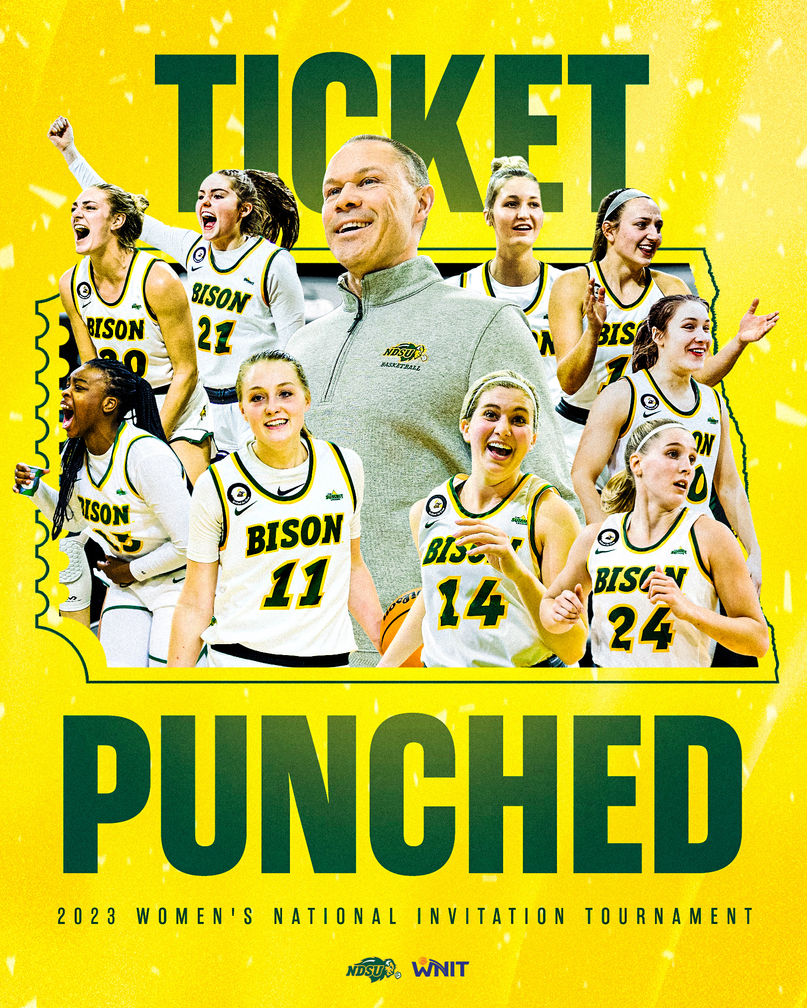
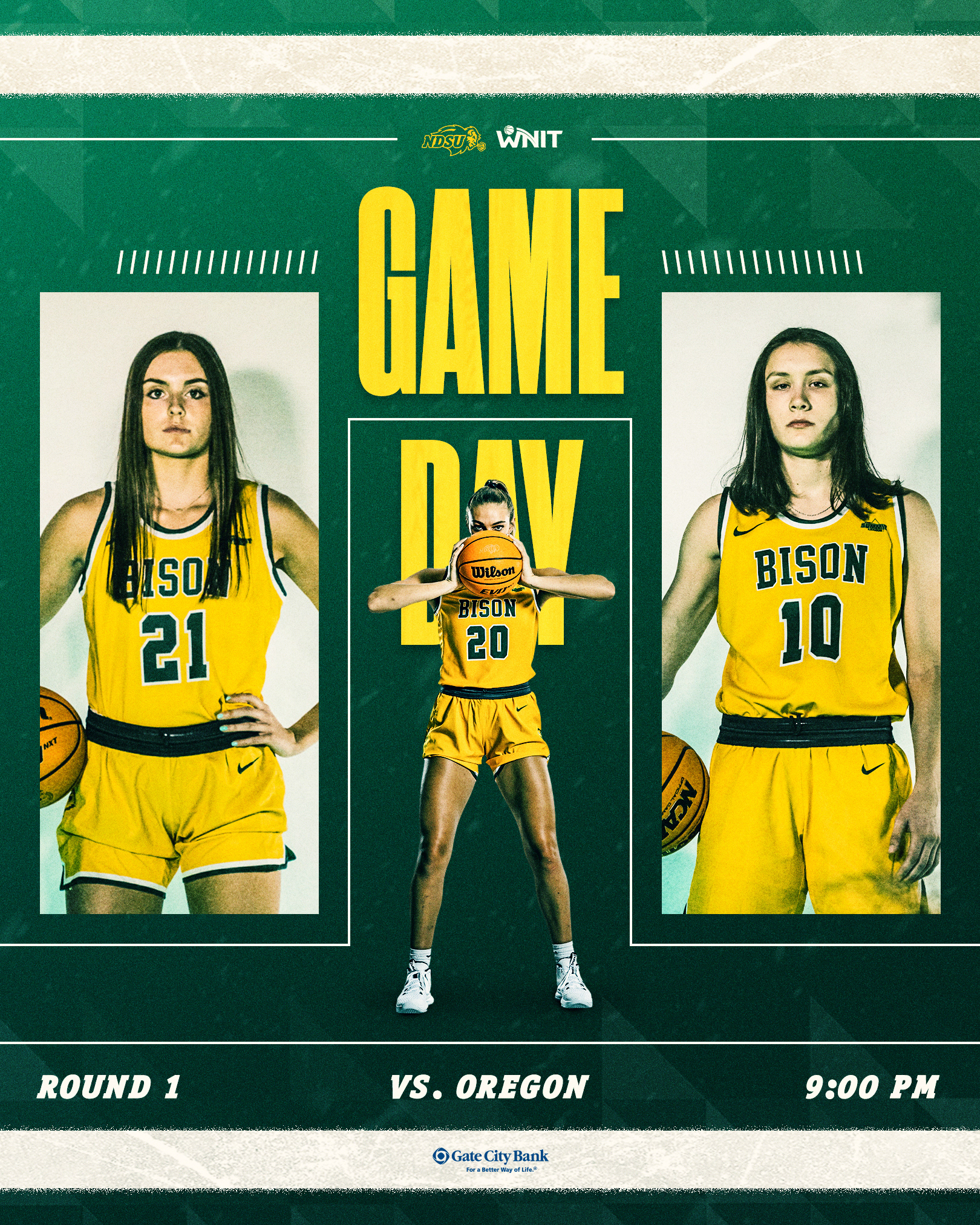
Keeping consistency with the men's basketball postseason branding, our WNIT run featured graphics and elements that fit the spirit of a winter in Fargo. A sharp contrast from the photo-heavy style, but a fitting change for our first WNIT appearance in program history.
Posters
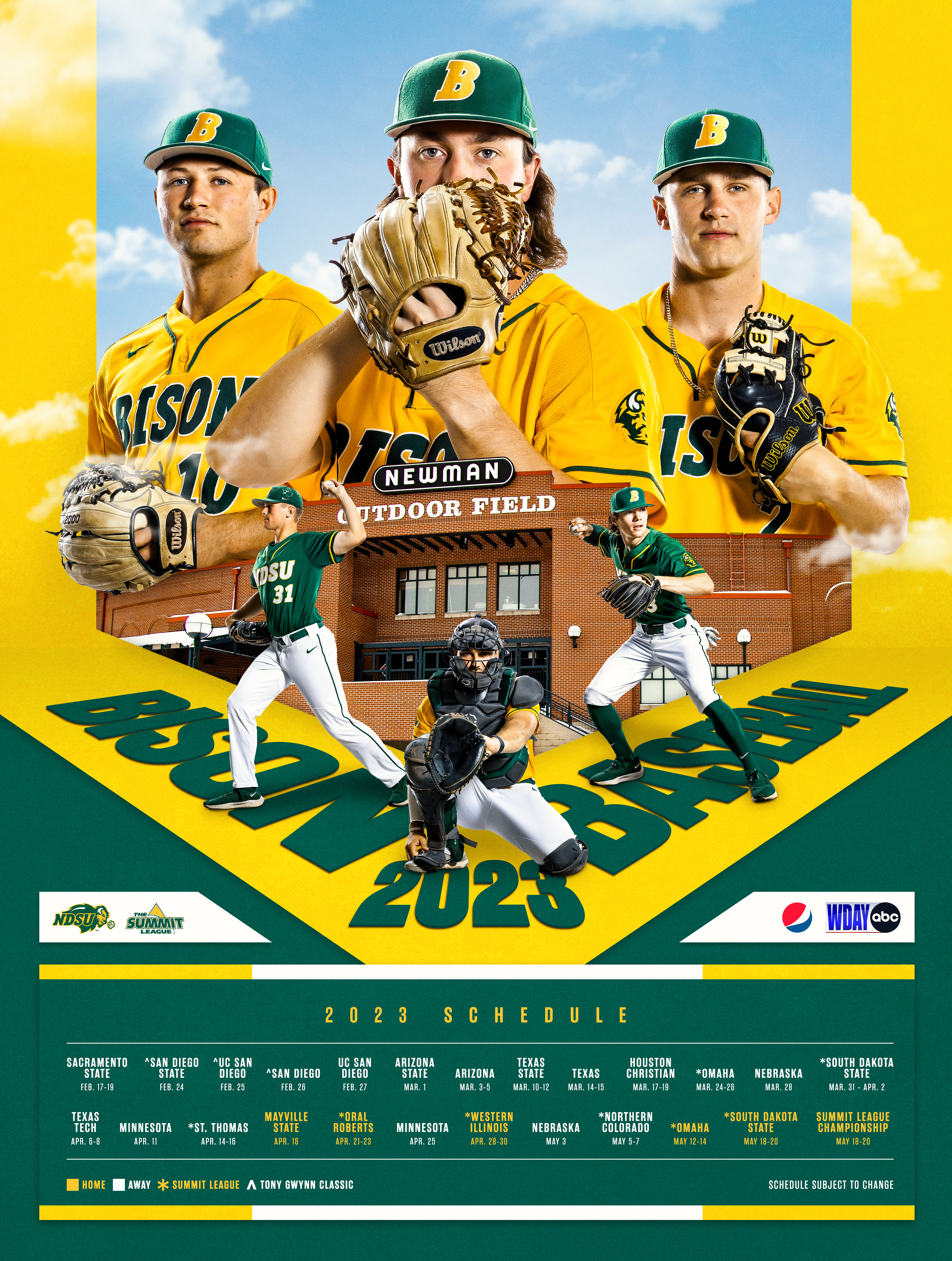
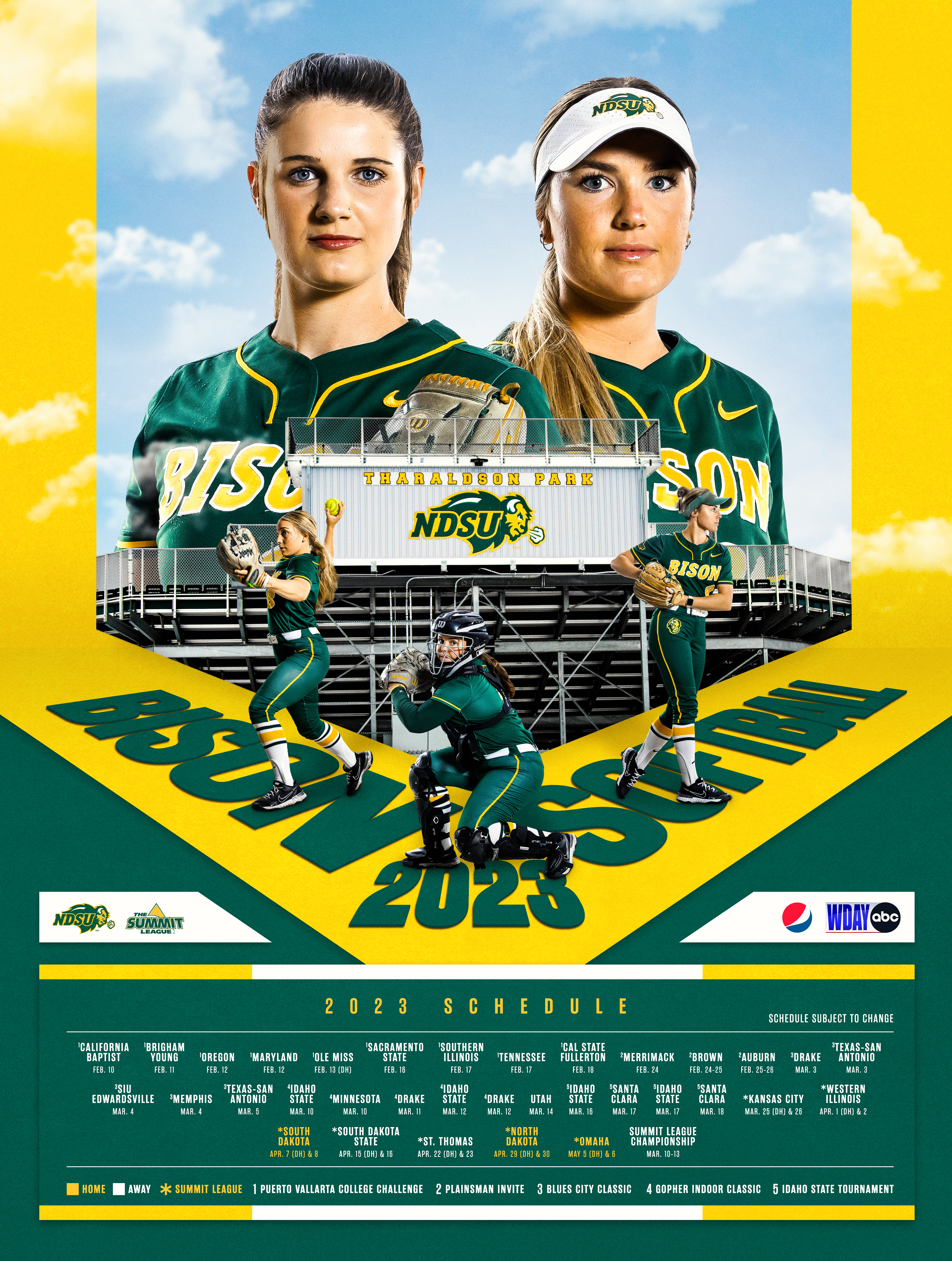
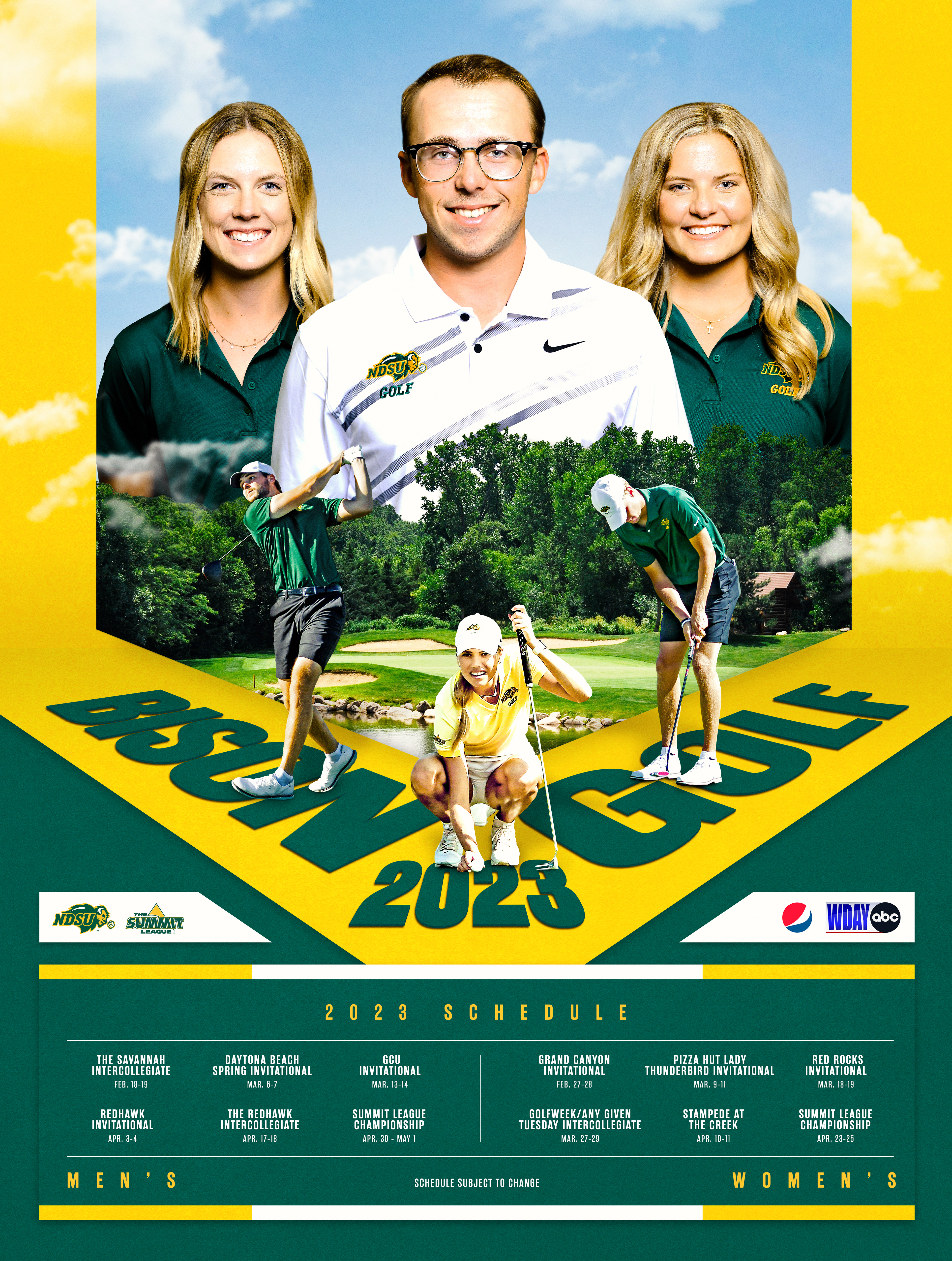
The theme I chose to stick by with the spring schedule posters involved the outdoors, where only a select few of NDSU's athletic programs play. While weather doesn't always work in our favor, a beautiful sunny day in North Dakota is hard to beat.
The posters feature our athletes in that setting, while also tying back to our classic green and gold brand. Using typography to provide depth, the composition of our athletes and venues fit naturally above a laid-out schedule of each sport's upcoming season.
